| Image |
Comment |
| 07/12/2007 01:28:44 AM |
|
 Photographer found comment helpful. Photographer found comment helpful. |
| 07/11/2007 04:27:26 PM |
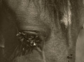
In Depth of Painby blacjackComment by SaraR: I guess this was probably meant for the Nightmare challenge. I shall comment as though it was, but won't leave a score.
By choosing a horse as your subject you are making a clever pun on the word nightmare. The choice of b&w (or duo-tone? - a bit hazy on the technicalities here) is good to illustrate nightmares as it somehow separates the scene out from reality (although there is a dichotomy here as this clearly IS reality..). The photo is well composed, adhering to the rule of thirds whilst maintaining a sparseness that concentrates the viewers mind on the pain and seeming never-ending discomfort that the horse is experiencing. The photo lacks 'punch', which is a problem with it as a stand-alone photograph, but actually in terms of the challenge is apt, as from my experience the visual elements of dreams and nightmares lac the clarity of reality. |
| Photographer found comment helpful. |
| 07/11/2007 07:45:46 AM |
|
| Photographer found comment helpful. |
| 07/08/2007 04:36:50 PM |
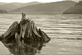
Ansel Adams Tributeby blacjackComment by EBJones: Nice image, and I like the processing you did here. My only issue is that it seems a bit tilted to the right. Otherwise, nice job. |
| Photographer found comment helpful. |
| 07/06/2007 11:17:32 AM |
|
| Photographer found comment helpful. |
| 07/05/2007 08:30:45 PM |
|
| Photographer found comment helpful. |
| 07/05/2007 07:42:52 PM |
|
| Photographer found comment helpful. |
| 07/05/2007 11:44:19 AM |
|
| Photographer found comment helpful. |
| 07/05/2007 07:03:09 AM |
|
| Photographer found comment helpful. |
| 07/04/2007 09:19:54 PM |
Ansel Adams Tributeby blacjackComment by BHuseman: I like this. the composition is great, aside from I think it is cropped just a tad too tight on the left. the tone is good, but the image overall looks a little flat. I would hav eliked a bit more contrast. Still worth a solid 7 though. More contrast would have gone 8, and the crop not being too tight would have gone 9. |
| Photographer found comment helpful. |
Home -
Challenges -
Community -
League -
Photos -
Cameras -
Lenses -
Learn -
Help -
Terms of Use -
Privacy -
Top ^
DPChallenge, and website content and design, Copyright © 2001-2026 Challenging Technologies, LLC.
All digital photo copyrights belong to the photographers and may not be used without permission.
Current Server Time: 07/16/2026 10:46:28 PM EDT.