| Image |
Comment |
| 08/25/2003 12:29:50 AM |
Final Voyageby moodvilleComment by jab119: i like the composition and the subject , however i feel it is a little too bright on the left hand side |
 Photographer found comment helpful. Photographer found comment helpful. |
| 08/24/2003 09:46:28 PM |
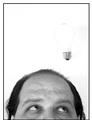
Not a Bright Ideaby moodvilleComment by KevinRiggs: Hmmm. The background and negative space concept works well with the human subject's head as there is enough contrast to bring out the features of the head. Adding the lightbulb detracts from this on one level as the bulb doesn't even have a continuous line defining its surface, causing it to blend with the negative space and leaving this viewer to wonder if any light is supposed to be coming from it (like a dimwitted idea - is this a barely lit bulb?). The noise to the right of each subject is a little distracting and draws from the negative space as well. I do think this is a bright idea for this contest but I think a hooded light source might have made for better results on the negative space. - 5 |
| Photographer found comment helpful. |
| 08/24/2003 08:29:08 PM |
Nightly Waitingby moodvilleComment by OneSweetSin: Critique Club
I love the drawing manniquins and I am very partial to them when I see them. This one is no exception to that. I love the whole concept here and think it meets the challenge nicely. It is a bit to soft but still has a very good composition going for it.
Keep up good efforts and I look forward to seeing more of your wooden pal in the future.
Anna |
| 08/24/2003 02:04:21 PM |
Not a Bright Ideaby moodvilleComment by kyrielle: I like the idea here, but it's so bright the shape of the bulb is almost lost. Is that an accident, or was there a bit of string or the like that had to be washed out also? It's very distracting and I think the picture would be much stronger if the bulb were slightly more defined. |
| Photographer found comment helpful. |
| 08/23/2003 04:28:21 PM |
|
| Photographer found comment helpful. |
| 08/23/2003 03:12:25 PM |
Onwardby moodvilleComment by PaulMdx: Composition: Would have prefered the white stone slightly more to the right. I may have tried crouching down more to fit more stones in the shot horizontally, unless there was stuff in the b/g.
Technical: Nice use of b&w. Good focus.
Meets challenge: Yes
Overall impression: Nice shadow, but composition lets it down a little.
[ If this style of comment is useful, please leave a few yourself! www.calcaria.net/dpc.html ] |
| Photographer found comment helpful. |
| 08/22/2003 04:14:23 PM |
|
| Photographer found comment helpful. |
| 08/22/2003 11:34:25 AM |
Onwardby moodvilleComment by jab119: I like the shot, but feel a shot with the camera a little lower to the gound would made a stronger image |
| Photographer found comment helpful. |
| 08/22/2003 01:04:37 AM |
Not a Bright Ideaby moodvilleComment by mzanoni: Interesting idea and I am wondering how you got the lightbulb suspended there? Focus is a little soft around your? eyes (which is a key component to get in focus). Whites are a littel too bright as well. BUT, this is still a strong image that I enjoyed. |
| Photographer found comment helpful. |
| 08/20/2003 08:17:17 PM |
|
Home -
Challenges -
Community -
League -
Photos -
Cameras -
Lenses -
Learn -
Help -
Terms of Use -
Privacy -
Top ^
DPChallenge, and website content and design, Copyright © 2001-2026 Challenging Technologies, LLC.
All digital photo copyrights belong to the photographers and may not be used without permission.
Current Server Time: 06/11/2026 03:05:45 PM EDT.