| Image |
Comment |
| 11/12/2003 12:49:06 PM |
|
 Photographer found comment helpful. Photographer found comment helpful. |
| 11/12/2003 10:26:56 AM |
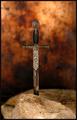
The Sword in the Stoneby moodvilleComment by joshua: i think this type of thing would have benfited from either a completely center or completely off center composition..it's kinda in limbo right now...exposure and sharpness are good and background color are nice as well...6 |
| Photographer found comment helpful. |
| 11/12/2003 01:51:37 AM |
The Sword in the Stoneby moodvilleComment by Neil: Niice capture, good DOF, but the composition could be more interesting (this one's centered, and the rock in front of the sword takes away from sword being the focal point. |
| Photographer found comment helpful. |
| 11/12/2003 12:43:17 AM |
The Sword in the Stoneby moodvilleComment by LucidLotus: Excellent photo. I love the way the sword & stone both pop against the background. Focus is great, lighting is good too. I really like the marbled look of the background, gives it an old-world feel. Very well done. 8 |
| Photographer found comment helpful. |
| 11/12/2003 12:20:45 AM |
|
| Photographer found comment helpful. |
| 11/11/2003 11:17:50 PM |
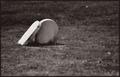
Lean on Meby moodvilleComment by Pedro: very nice. feels lonely or something. great tones...sepia is a difficult duptone to pull off well, and you - or your software ;) - did it well.
Pedro |
| Photographer found comment helpful. |
| 11/11/2003 06:20:49 PM |
|
| Photographer found comment helpful. |
| 11/10/2003 08:24:40 PM |
Lean on Meby moodvilleComment by adine: I like the simplicity of the composition. I like how one stone leans against the other and appears to "look" into the heavens. If the stones were composed in the bottom right corner it would give some space for the stone to be facing into. |
| Photographer found comment helpful. |
| 11/10/2003 07:59:20 PM |
|
| Photographer found comment helpful. |
| 11/10/2003 07:49:59 PM |
Lean on Meby moodvilleComment by sonnyh: While I do believe that you have filled the requirement of the challenge the execution is a little not quite there. The picture has no punch, the grave stone is washed out (the one that is leaning on the other) and the blurry grass in front is taking away from the picture. In this case I think that maybe this would have come out better in color with some saturation of the grass. Only my opinion though. |
Home -
Challenges -
Community -
League -
Photos -
Cameras -
Lenses -
Learn -
Help -
Terms of Use -
Privacy -
Top ^
DPChallenge, and website content and design, Copyright © 2001-2026 Challenging Technologies, LLC.
All digital photo copyrights belong to the photographers and may not be used without permission.
Current Server Time: 06/18/2026 08:19:03 AM EDT.