| Image |
Comment |
| 06/04/2003 03:02:14 PM |
|
| 06/04/2003 02:11:53 PM |
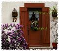
17by nathaliedooComment by Olyuzi: Natalie, I disagree with those who dislike the border. I think it adds tremendously to an already fine shot and gives your photo a very artistic feel. The border draws attention to the stucco texture of the house and red wood on either side of the door, and gives the picture a whole new dimension. Very well done on this aspect.
I like the simple composition too, though I wish the two branches on the side were out of the frame and find the shot to be a bit underexposed. I think a little more exposure would have brought out more of the colors in the wreath, which are hard to see. I gave you a 10. Congrats on very fine work and good luck in future challenges. |
| 06/03/2003 04:45:27 PM |
17by nathaliedooComment by skief: Pretty, just watch out for the 2 branches as you come to the door. |
| 06/03/2003 01:37:06 PM |
|
 Photographer found comment helpful. Photographer found comment helpful. |
| 06/02/2003 07:49:06 PM |
17by nathaliedooComment by JPR: very nice, but i dont think such borders are legal. |
| 06/02/2003 06:53:44 PM |
|
| 06/02/2003 06:41:45 PM |
Pump Up the Volume!by nathaliedooComment by qachyk: What a strange effect. I'm very curious how you did it.
I think the idea is a good one, but I dont' really care for this result; the patches of colour seem to be random artifacts rather than intentional, and the abstract feel lended as a result is, unfortunately for you, not something I care for. (Well, it may not be unfortunate; it's not like you were out to impress me specifically, but, er, okay, I'm getting sidetracked again, really must sleep more before writing these...) |
| 06/02/2003 05:03:41 PM |
17by nathaliedooComment by carolee: I love the postcard feel of the border on this image, and the title in this case does add to the image. I find the branches on the right a little distracting but overall really like the mood. |
| Photographer found comment helpful. |
| 06/02/2003 04:35:15 PM |
17by nathaliedooComment by peter_k: I like the match of border and wall texture, but the white is quite strong and might be better if toned down slightly to match the photo's colours. |
| Photographer found comment helpful. |
| 06/02/2003 04:29:28 PM |
|
| Photographer found comment helpful. |
Home -
Challenges -
Community -
League -
Photos -
Cameras -
Lenses -
Learn -
Help -
Terms of Use -
Privacy -
Top ^
DPChallenge, and website content and design, Copyright © 2001-2026 Challenging Technologies, LLC.
All digital photo copyrights belong to the photographers and may not be used without permission.
Current Server Time: 07/17/2026 06:41:25 PM EDT.