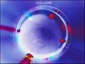
DPChallenge: A Digital Photography Contest You are not logged in. (log in or register
 
Browse Settings
Currently viewing:
Registered Usernathaliedoo

Show comments:

Per page:

Order:

Comments:


Comments Received by nathaliedoo
Pages:   ... ... [94]
Showing 381 - 390 of ~939
Image Comment
Me
06/18/2003 05:56:15 AM
Me
by nathaliedoo

Comment by shadow:
i like the way your hair flows and the way they glowed. 7
Photographer found comment helpful.
Church at Night
06/17/2003 07:42:13 PM
Church at Night
by nathaliedoo

Comment by hawkida:
Very pretty.
Photographer found comment helpful.
Church at Night
06/16/2003 03:47:50 PM
Church at Night
by nathaliedoo

Comment by Mitonski:
Its a nice idea and a great view, but the church itself seems to be a pretty minimal element to the picture.
Church at Night
06/16/2003 02:13:43 PM
Church at Night
by nathaliedoo

Comment by eloise:
The church is darn close to centered, and the circular path certainly is, so I'll have to grade this down a bit on theme grounds. :-/
Church at Night
06/16/2003 01:20:27 PM
Church at Night
by nathaliedoo

Comment by alanfreed:
Great use of available lighting -- I like it! I like the way the church rises above the scene. Would have been interesting to see it closer up, too.
Photographer found comment helpful.
Church at Night
06/16/2003 04:28:51 AM
Church at Night
by nathaliedoo

Comment by JPR:
Wow great colors. It really pops. Like everything except the sky which seems too grainy.
Photographer found comment helpful.
Pump Up the Volume!
06/12/2003 02:50:06 PM
Pump Up the Volume!
by nathaliedoo

Comment by HBunch:
*Critique Club*
Well, to be perfectly honest, I don't really care for this image. I'm not even really sure what the heck it is.
I mean, it says volume, but it doesn't show what the volume is. It could be turned way down to 1 for all I can tell. There are little blotches all over the place which COULD be the volume markers, but can't really see any specifically pointing at a number. So this doesn't really imply sound to me.
I don't think that this would appeal more to me had the subject been off center, but it's worth a shot. Maybe some dramatic angle would add a bit of interest to this.
The focus appears to be good on the numbers, however, I'm not positive, cause the post processing made a LOT of grainy noise on this shot.
I think that the colors are good together, but as a whole, they just don't seem to fit in together. Can't even tell that there is a CD anywhere in your shot, and had you not mentioned it, I would never have known.
Overall, this just isn't my kind of thing.
~Heather~
17
06/10/2003 12:59:20 PM
17
by nathaliedoo

Comment by nathaliedoo:
Anna:
I really appreciate your comments. The light condition were poor since it was raining that day! Also, this is not my house so I couldn't just go and cut the bothering branches! But indeed, they detract. Thanks again for taking the time to comment.

Olyuzi:
Thanks for your very kind comments. It's always surprising to see how hard are people as soon as you put a border. Also, when I see one's for this shot (or many other that are even winners), I wonder what are their criterias!!!!!! Well, you are right the shot itself could be improved (maybe with post-editing which was not allowed for the challenge since at shooting time conditions were rain and foreign house so no branch cutting!!!). Thanks again!
17
06/10/2003 12:01:03 PM
17
by nathaliedoo

Comment by OneSweetSin:
*Critique Club*

Very pretty says welcome home and in that definately says Home Sweet Home. The boarder you used added to the image and gave it more of a feeling. The colors for the most part are good and the focus is really good. The texture is very nice in this photo and its like you can actually feel the roughness.

As someone mentioned the two branches in front of the door look like you could get hit by them but at the same time they also take away from the door and almost give it an appearance of being cut in 3 pieces. It also needs a little stronger lighting at the top of the door it is just to shadowy.

Over all this is a really homey feeling photo and it really well done. Keep up the good work.

Anna
That Old Wheelbarrow
06/04/2003 08:30:59 PM
That Old Wheelbarrow
by nathaliedoo

Comment by HBunch:
*Critique Club*
It says you added a bit of a brownish tint, but it looks black and white. I wonder if a lighter brown tint (closer to sepia) would have worked more effectively here. While I think you did a nice job with the photo, it's lacking something in my opinion.
I think the plants on top of the little wagon lack detail. Looks like a lighting issue combined with the grainyness. When the details in something aren't really clear to begin with, then you add elements to it, it kind of makes it all mushy looking.
There is a patch of grass right in front of the wagon that looks like it's all matted down and trampled on. I wonder if you could have moved the wagon over to the left just a little bit to get that bad section of grass out of the shot?
Focus and clarity look ok on the wagon and on the background items. i think though that maybe the background is another contributor to why the plants on the cart look not right. They kind of all blend in together. Really busy looking ontop of that wagon. lol
Overall, you did achive the look you were going for. Looks real old and so does the photo. Curious to see how a lighter brown would have looked.
~Heather~
Photographer found comment helpful.
Pages:   ... ... [94]
Showing 381 - 390 of ~939


Home - Challenges - Community - League - Photos - Cameras - Lenses - Learn - Help - Terms of Use - Privacy - Top ^
DPChallenge, and website content and design, Copyright © 2001-2025 Challenging Technologies, LLC.
All digital photo copyrights belong to the photographers and may not be used without permission.
Current Server Time: 08/19/2025 08:30:24 AM EDT.