| Image |
Comment |
| 07/06/2006 03:58:51 PM |
THE LEADERby a_jhambComment by Nald: I'm thinking this shot would work well in B/W. Colors are too distracting IMHO. |
| 07/06/2006 02:20:45 PM |
THE LEADERby a_jhambComment by Dr.Confuser: I am sure you would disagree or you wouldn't have entered the photo in this challenge, but IMO DNMC. |
| 07/06/2006 06:56:58 AM |
|
| 07/05/2006 08:25:55 PM |
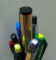
THE LEADERby a_jhambComment by Gracechild7: Very heavily center weighted. I might have tried moving the background farther away from the subject in order for it to blur a little more outside the dof, and brought the pens all completely into focus. A little more light on the pens would have helped them pop a little more as well. For this type of "stock" photography, I would encourage you too look at different office product catalogs to see how they compose images of writing instruments, etc. |
| 07/05/2006 05:09:53 PM |
|
| 07/05/2006 10:32:15 AM |
|
| 07/05/2006 09:02:52 AM |
|
| 07/05/2006 12:54:39 AM |
|
Home -
Challenges -
Community -
League -
Photos -
Cameras -
Lenses -
Learn -
Help -
Terms of Use -
Privacy -
Top ^
DPChallenge, and website content and design, Copyright © 2001-2026 Challenging Technologies, LLC.
All digital photo copyrights belong to the photographers and may not be used without permission.
Current Server Time: 04/01/2026 05:55:34 AM EDT.