| Image |
Comment |
| 07/16/2006 12:27:42 PM |
|
| 07/13/2006 07:14:37 AM |
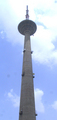
Sky is the LIMITby a_jhambComment by atupdate: These are very difficult lighting conditions to shoot under. The exposure for the sky is well done; however, the back lighting makes the main object look flat. The sharpest focus on the main object appears to be at the top of the image where it meets the clouds. The bright clouds makes it very difficult to look there for any length of time, which sends my eye back to the lower half of the structure which is not as sharp in focus. |
 Photographer found comment helpful. Photographer found comment helpful. |
| 07/12/2006 07:10:49 AM |
|
| 07/11/2006 05:34:37 PM |
|
| 07/11/2006 07:31:39 AM |
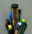
THE LEADERby a_jhambComment by lauralink: Colorful macro composition, but falls short of meeting the challenge for me. Wait! Is that writing paper in the distance? |
| 07/10/2006 08:02:23 AM |
|
| 07/08/2006 02:46:51 PM |
THE LEADERby a_jhambComment by yanko: A little too soft for me. The leader is also not the main focal point as my eyes go to that bright shiny reflection on one of the subordinate pens. I do like the idea so here are some suggestions if you decide to reshoot in the future:
A.) Cleaner looking pens - too many specks on them and the "leader" pen could have looked more "brilliant". If the lighting was done differently (see below) I think that pen could have looked more shiny and stand out more.
B.) Cleaner looking background - The current one looks too muddy. Using a dedicated light source just for the background would help.
C.) Light the subjects from below and to the side and not from above or keep the above lighting but use it only as a fill light and not your main source. If that's your house lights then use a quicker shutter speed to reduce that lighting source or dim the lights a bit if you have that option but only if you are using other light sources like the ones mentioned above.
D.) Maybe use some more pens to fill the space on the left and right and perhaps make this a landscape shot? Including more pens would make it look more over the top which would help give this some added wow factor, IMO. |
| Photographer found comment helpful. |
| 07/07/2006 09:33:03 AM |
THE LEADERby a_jhambComment by atupdate: You need to play around with the lighting a little bit her to help give this image more definition and appeal. The background would improve considerably if it were a brighter white and the depth of focus is a bit too shallow on the pens. |
| 07/06/2006 08:09:15 PM |
THE LEADERby a_jhambComment by Nobody: Nice idea. More contrast between the foreground and background would be an improvement. 6. |
| 07/06/2006 07:00:34 PM |
THE LEADERby a_jhambComment by xuan768: Was a fridge used as the background? The texture is kind of distracting and the reflections on the "leading pen" detract a little bit. |
Home -
Challenges -
Community -
League -
Photos -
Cameras -
Lenses -
Learn -
Help -
Terms of Use -
Privacy -
Top ^
DPChallenge, and website content and design, Copyright © 2001-2026 Challenging Technologies, LLC.
All digital photo copyrights belong to the photographers and may not be used without permission.
Current Server Time: 04/01/2026 09:48:21 PM EDT.