| Image |
Comment |
| 12/20/2006 10:44:45 PM |
|
 Photographer found comment helpful. Photographer found comment helpful. |
| 12/20/2006 11:02:40 AM |
|
| Photographer found comment helpful. |
| 12/13/2006 12:16:44 PM |
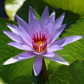
Lilyby BadgerComment by kausikmpi: From Critique Club,
I think this is an excellent juxtaposition of near complementary colors with the contrast in the colors making the picture bright and eye catching. Here the square crop enhances the picture without emphasizing any of the directions which serves the purpose of the picture that is to focus on the radial symmetry of the flower. The little glowing spot at the centre serves as the starting point of interest. Radial symmetry in the centre, petals and also to some extent in the leaves makes the image harmonious.
There are a few details in composition that I would like to point out. Firstly, the centre of attraction is at the dead center. Which when taken together with the radial symmetry may have caused a loss in interest for the viewer, the viewer then appreciates the beauty of the flower and not the way the picture was perceived. As far as I am concerned I would place a center of interest exactly at the center only if the background (if in focus) or other in focus objects has enough asymmetry and substance in it to hold the attention. Secondly the bright spot on the top left corner leads my eyes away from the picture (maybe just mine), imho, it would have been great to have cropped it.
Technical considerations: I believe F 6.3 is a correct decision. It creates interesting layers of continuously blurring textures of the leaves giving the impression of depth and perspective.
All in all I like the way the shot was taken and would experiment with the same from different angles to see if asymmetry in positioning can create a more stunning and original version of the same. Message edited by author 2006-12-14 06:54:27. |
| Photographer found comment helpful. |
| 12/01/2006 11:03:26 PM |
Lilyby BadgerComment by ralfw: The light ray in the center catches my eye, draws me in to appreciate the flower - well done! Good choice on the square crop too. |
| Photographer found comment helpful. |
| 07/18/2006 12:52:53 PM |
|
| Photographer found comment helpful. |
| 07/13/2006 05:15:43 PM |
|
| Photographer found comment helpful. |
| 07/12/2006 11:30:21 AM |
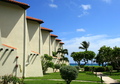
Cayman Condoby BadgerComment by JunieMoon: Very strong lines on this one. Cropping to focus strictly on the left of the image would have really brought out the lovely slants of the shadows. |
| Photographer found comment helpful. |
| 07/09/2006 05:30:11 AM |
Harbour Centre, George Townby BadgerComment by Aghris: Greetings from the Critique Club:
I like this picture. Although the the subject is not very interesting, I like the different tones of blue. That said, there are some things to improve upon. The crop shows slightly too much sky, and the column at the bottom annoys me a bit. I would either crop it closer, or show a bit more of it. On the other hand, ending the diagonals to the corners of the picture also gives some impact, so maybe crop a tighter to the left and right too.
I do like the reflection of the cloud, but not the reflection of the wire(?) at the bottom. Also the little dab of birds poo in the lower left corner is distracting. I realise that there wasn't much you could do about that in a Basic Editing Challenge, though.
Good picture, but maybe increase the contrast and sat. a bit to show more tones of blue.
|
| Photographer found comment helpful. |
| 07/03/2006 03:45:10 PM |
|
| Photographer found comment helpful. |
| 07/01/2006 04:41:27 PM |
|
| Photographer found comment helpful. |
Home -
Challenges -
Community -
League -
Photos -
Cameras -
Lenses -
Learn -
Help -
Terms of Use -
Privacy -
Top ^
DPChallenge, and website content and design, Copyright © 2001-2026 Challenging Technologies, LLC.
All digital photo copyrights belong to the photographers and may not be used without permission.
Current Server Time: 07/15/2026 11:19:03 PM EDT.