| Image |
Comment |
| 12/14/2006 03:07:55 PM |
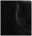
grimby shoelessajComment by colorcarnival: I can see that it is a black cat but on my monitor, it looks very dark and a lot of detail is lost. It would be interesting to see what this photo looks like a little lighter. |
 Photographer found comment helpful. Photographer found comment helpful. |
| 12/14/2006 12:26:29 PM |
|
| Photographer found comment helpful. |
| 12/14/2006 07:09:04 AM |
grimby shoelessajComment by timfythetoo: I really like images like this. While maybe not a ribbon winner in this challenge it is still strong. Bumping up to 8 and adding to my faves. |
| Photographer found comment helpful. |
| 12/13/2006 11:57:18 PM |
|
| Photographer found comment helpful. |
| 12/13/2006 10:42:19 PM |
grimby shoelessajComment by sfalice: You took a chance with this black on black portrait.
To me, in any event, it worked. The modeling is just
lovely on this cat.
Unfortunately, you may be at the mercy of monitors that
are not perfectly calibrated. I hope not. |
| Photographer found comment helpful. |
| 12/13/2006 10:00:42 PM |
|
| Photographer found comment helpful. |
| 12/13/2006 08:34:06 PM |
grimby shoelessajComment by CNovack: I can make out very few details of the face. I can barely see the nose, there is no eye (I am going to assume that this is a sleeping cat) and the head is vaguely outlined by the sheen of the hairs picking up the lighting. Mayhap it might be that the monitor calibration is the culprit or upping the gamma or brightness & contrast might help the cat be more visible. Having a black cat on a black background is very challenging because you don't have contrasting colors. Thus lighting becomes very important. Mayhap you needed a stronger light or another light to illuminate the left half of the cat's face seen here so that the viewer could greater appreciate the features of this sleeping cat. |
| 12/13/2006 05:33:36 PM |
|
| Photographer found comment helpful. |
| 12/13/2006 02:45:58 PM |
grimby shoelessajComment by J-Me: Really artsy shot! Love the composition. I'm wondering if since this was an advanced editing challenge, if you could have selected the head, copied and pasted it onto a separate layer and just sort of lightened that portion a bit and played with the saturation, or perhaps, color, it might have brought the face out a bit more??? The way it sits now, it seems to blend in so much that you really have to look to see the separations. I like your view on this shot though. Really artsy look. Would make a GREAT painting!!! |
| Photographer found comment helpful. |
| 12/13/2006 02:06:31 PM |
|
| Photographer found comment helpful. |
Home -
Challenges -
Community -
League -
Photos -
Cameras -
Lenses -
Learn -
Help -
Terms of Use -
Privacy -
Top ^
DPChallenge, and website content and design, Copyright © 2001-2026 Challenging Technologies, LLC.
All digital photo copyrights belong to the photographers and may not be used without permission.
Current Server Time: 07/17/2026 12:33:08 AM EDT.