| Image |
Comment |
| 06/23/2006 02:03:41 AM |
Shatteredby snafflesComment by mpeters: Dial down your exposure. The pic also seems blurry, maybe handheld zoom or digital zoon on a P&S camera??? |
 Photographer found comment helpful. Photographer found comment helpful. |
| 06/22/2006 11:38:32 PM |
Shatteredby snafflesComment by RayEthier: The lighting, cropping, composition, and subject matter are all rather bland, with the ensuing results being that this image with not fare well in this challenge.
Keep plugging away, for it is only through time, effort and dedication that we can ever hope to improve. |
| Photographer found comment helpful. |
| 06/22/2006 10:54:08 PM |
Shatteredby snafflesComment by annah: Hmmm...well. I think think the focus is a little too soft for me. the highlights in the wings also seem a bit blown out. a different angle and better focus could make this a really interesting pic. |
| Photographer found comment helpful. |
| 06/21/2006 11:56:03 PM |
|
| Photographer found comment helpful. |
| 06/21/2006 07:28:28 AM |
|
| Photographer found comment helpful. |
| 06/20/2006 10:49:38 PM |
Shatteredby snafflesComment by neophyte: Great idea that needs some more clarity to really communicate what you want. ( My humble opinion anyway..) |
| Photographer found comment helpful. |
| 06/20/2006 07:53:31 PM |
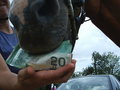
Nothing's too good for my horse!by snafflesComment by Dr.Confuser: Okay, so I get the concept. But it could be better executed in my opinion. Car in the background distracts from the message. Clip on the money is incongruous. Brights are too bright, and darks lose some detail and color saturation that could have been interesting. Put the girl's face in the frame with more of the horse's head and convince me of a loving relationship set in a pastoral setting ... and I'm almost there with you. |
| Photographer found comment helpful. |
| 06/20/2006 08:41:33 AM |
Shatteredby snafflesComment by Aghris: Sad, certainly, and probably very desolate, but the photo is very flat and uninteresting. Also, with a shot like this you would want your main subject to be in crisp focus, but it appears the focus is here a few centimeters off. Giving it a more interestin crop could've helped immensely, you don't really need so much dirt arounf the wings. |
| Photographer found comment helpful. |
| 06/20/2006 03:28:59 AM |
Shatteredby snafflesComment by jdannels: This is a nice find but I wish it had more detail and was abit more in focus. Also I don't know what you use to prepare your images for challenges but you might look at this link. You can get more detail if you use the full 150 kb file size limit, yours is 70kb. Hope this is elpful. |
| Photographer found comment helpful. |
| 06/20/2006 12:58:41 AM |
Shatteredby snafflesComment by taterbug: Interesting choice of subject. Looks like the focus is kind of off though. Possibly the camera was too close to subject? Inside the minimum focus distance. Or perhaps camera shake from being hand held and lo light? |
| Photographer found comment helpful. |
Home -
Challenges -
Community -
League -
Photos -
Cameras -
Lenses -
Learn -
Help -
Terms of Use -
Privacy -
Top ^
DPChallenge, and website content and design, Copyright © 2001-2026 Challenging Technologies, LLC.
All digital photo copyrights belong to the photographers and may not be used without permission.
Current Server Time: 07/16/2026 09:53:08 PM EDT.