| Image |
Comment |
| 07/12/2006 06:54:10 PM |
|
 Photographer found comment helpful. Photographer found comment helpful. |
| 07/12/2006 04:46:27 PM |
|
| Photographer found comment helpful. |
| 07/12/2006 03:53:01 AM |
|
| Photographer found comment helpful. |
| 07/12/2006 12:43:37 AM |
|
| Photographer found comment helpful. |
| 07/11/2006 09:38:04 PM |
|
| Photographer found comment helpful. |
| 07/11/2006 08:53:14 PM |
|
| Photographer found comment helpful. |
| 07/10/2006 08:23:06 AM |
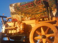
Station(ary) Wagonby snafflesComment by atupdate: I find it difficult to determine if this is a full size replica or a minitature. The lighting is a bit harsh and tends to give the image a washed out look. There is an object behind the wagon on the far right side that is seems to muddy the details on that side of the image. |
| Photographer found comment helpful. |
| 07/08/2006 12:52:59 PM |
Station(ary) Wagonby snafflesComment by puzzled: Hmmm, there's a little too much to look at in this image for me, plus the gothic glow is a little strong, particularly on the left. The cloth is pretty and the color of the sky is gorgeous. I feel like a lot is missing by being cropped sort of here and there, rather than showing, for example, the whole left hand side, the whole wheel, etc. |
| Photographer found comment helpful. |
| 07/02/2006 12:54:27 AM |
Shatteredby snafflesComment by MattO: Hello from the Critique Club. After viewing the photo I have some suggestions for you. First its a great subject and the depiction of desolation is pretty well there. However the photo has some definate focus issues. And the moth seems to almost be blown out with very little detail and clarity. Centering and shooting straight down also seems to take away. Perhaps shooting at an angle and focusing on your subject and then recomposing your photos. Dont be afraid to compliment your photo with some editing, sharpening and adjusting colors, brightness, and contrast. Overall the photo scored about where I would have scored it. Good luck in future challenges. |
| Photographer found comment helpful. |
| 06/27/2006 12:02:57 PM |
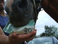
Nothing's too good for my horse!by snafflesComment by scarbrd: ---Greetings form the Critique Club!---
First impression - This communicates wastefulness more than indulgence.
It's not like the horse would prefer the taste of money over real food.
The composition shows good depth, but the car is distracting and doesn't really add anything to the image. The clip obviously should not have been included.
I do like the expression on the person's face.
I think better awareness of the surroundings and the light, plus the horse eating something other than money would help this good idea score better.
I hope this was helpful. Feel free to contact me if you have any questions.
David
|
| Photographer found comment helpful. |
Home -
Challenges -
Community -
League -
Photos -
Cameras -
Lenses -
Learn -
Help -
Terms of Use -
Privacy -
Top ^
DPChallenge, and website content and design, Copyright © 2001-2026 Challenging Technologies, LLC.
All digital photo copyrights belong to the photographers and may not be used without permission.
Current Server Time: 07/17/2026 12:19:27 AM EDT.