| Image |
Comment |
| 05/04/2007 11:22:40 AM |
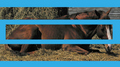
Grieving geldingby snafflesComment by Jedusi: I'm sure it's been mentioned already, but the blue is too heavy and too loud. It is also not sympathetic to the picture in that there are no natural blue elements that it is picking up on or reflecting.
Hope this helps.
edit for atrocious spelling : )
Message edited by author 2007-05-15 16:01:55. |
 Photographer found comment helpful. Photographer found comment helpful. |
| 05/04/2007 12:37:33 AM |
|
| Photographer found comment helpful. |
| 05/03/2007 10:14:15 PM |
Grieving geldingby snafflesComment by LN13: Oh my. The blue is just way too much. If it had been white and maybe a little thinner, I would have liked this a lot more. |
| Photographer found comment helpful. |
| 05/03/2007 09:09:04 PM |
Grieving geldingby snafflesComment by McFrikki: The blue color is terrible, the stitching is just terribly distracting and there is no way to look at this photograph at all. |
| Photographer found comment helpful. |
| 05/03/2007 06:18:48 PM |
Grieving geldingby snafflesComment by Elaine: The first thing I see is the blue. I have to make myself look for the horse, and any emotion he is feeling is lost by the distraction of the lines. |
| Photographer found comment helpful. |
| 05/03/2007 06:02:47 PM |
|
| Photographer found comment helpful. |
| 05/03/2007 05:28:50 PM |
|
| Photographer found comment helpful. |
| 05/02/2007 08:23:28 PM |
Grieving geldingby snafflesComment by Beautiful-Joe: Beautiful horse.
Anywho, the image looks a bit noisy or out of focus. I can't really tell which. It does give a certain feel, though.
The bright blue is an interesting choice. It doesn't seem to fit the images very well, though.
Also, I'm just curious, is that bump on the horses hindquarters really there, or was it created when putting the pictures together? |
| Photographer found comment helpful. |
| 05/02/2007 03:24:52 PM |
|
| Photographer found comment helpful. |
| 05/02/2007 12:16:06 PM |
Grieving geldingby snafflesComment by UNCLEBRO: well, that certainly is some unusual editing there!
it's almost like an optical illusion.
"which is the longer piece, A, B or C?"
:-)
but seriously, nice photo, but i'm not too keen on the way you've divided it.
the blue does nothing for the image in my opinion. |
| Photographer found comment helpful. |
Home -
Challenges -
Community -
League -
Photos -
Cameras -
Lenses -
Learn -
Help -
Terms of Use -
Privacy -
Top ^
DPChallenge, and website content and design, Copyright © 2001-2026 Challenging Technologies, LLC.
All digital photo copyrights belong to the photographers and may not be used without permission.
Current Server Time: 07/22/2026 08:06:29 PM EDT.