| Image |
Comment |
| 09/05/2009 01:37:42 PM |
|
 Photographer found comment helpful. Photographer found comment helpful. |
| 09/02/2009 03:19:32 PM |
|
| Photographer found comment helpful. |
| 09/02/2009 10:07:32 AM |
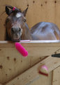
Silent Observerby snafflesComment by JulietNN: Hi from the C Club!
Now I gave this a 9 when it ws in voting, here are the reasons why. The challenge description reads "Use compelling lighting or subject matter to create a dramatic photo."
I found in this shot that you did use compelling lighting. The lighting is excellent and in turn makes your subject more interesting. The lights and darks of this shot are spot on. I think that most people didn't read or understand the description. You did.
Maybe without the head piece it would have given you a point or two more. Your post processing is excellent, maybe just drop out the top above the ears to get rid of the white bar.
I am and was very happy when i saw this shot. well done
|
| Photographer found comment helpful. |
| 09/01/2009 04:47:29 AM |
Silent Observerby snafflesComment by BJokerud: Your shadows are great, and your b&w conversion is good. But there's something missing. It could be that it's not propperly focused. |
| Photographer found comment helpful. |
| 08/31/2009 06:58:37 PM |
|
| Photographer found comment helpful. |
| 08/27/2009 07:38:02 PM |
|
| Photographer found comment helpful. |
| 08/26/2009 04:54:35 PM |
|
| Photographer found comment helpful. |
| 08/26/2009 02:36:36 PM |
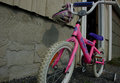
Leaving homeby snafflesComment by poser: Hey I also like the angle of this it put me on the level of the person riding the bike. |
| Photographer found comment helpful. |
| 08/26/2009 12:38:23 AM |
Leaving homeby snafflesComment by JulietNN: Me again from the C Club!!
I was one of your high voters in this challenge and here is why
I liked the POV that you had going on here, I like that you went from the ground up versus straight on. You took time out to look at your subject and knew it would need a different angle to make it work.
I think what is hurting it here is the crop, which could have been a lot tighter on the left hand side, to give it a right in your face look, the wheel that is cut off in the front and the darkness of the shot,
The pink is perfect, your sharpness is spot on, clarity and DOF is good. |
| Photographer found comment helpful. |
| 08/20/2009 04:36:39 PM |
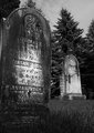
The Headstonesby snafflesComment by Ecce_Signum: Greetings from Andi via the Critique Club
First Impression: Hmm, have looked at this for a while now and the jury is still out on whether I like it or not.
Composition: I like the composition and the foreground stone leaning helps give impact to the image. I'm wondering if an even lower perspective would help chop the trees from the top of the foreground stone?
Subject: I did wonder if this had been an idea for the death challenge and it might even have score better in it. I've never heard of the band (am an old man now) but am sure its out there ;)
Technical:I think this is the area that confused me when first viewing the image. The 'issue' here is the image appears to have been oversharpened - probably to allow us to read more of the gravestone however, it messed with the treetops, the edge of the gravestone and also the grass bottom right. I like the lighting on the foreground gravestone but it looks false on the background stone.
Final thoughts: I didn't vote in this challenge but would probably have left a 5. Now, if you had taken the image on a moonlit night with some moody clouds then a 6 would have been my starting point. BTW, you should try a lensbaby, they are made for images like this! |
| Photographer found comment helpful. |
Home -
Challenges -
Community -
League -
Photos -
Cameras -
Lenses -
Learn -
Help -
Terms of Use -
Privacy -
Top ^
DPChallenge, and website content and design, Copyright © 2001-2026 Challenging Technologies, LLC.
All digital photo copyrights belong to the photographers and may not be used without permission.
Current Server Time: 05/23/2026 02:27:24 PM EDT.