DPChallenge: A Digital Photography Contest You are not logged in. (log in or register
 
Browse Settings
Currently viewing:
Registered Usersnaffles

Show comments:

Per page:

Order:

Comments:


Comments Received by snaffles
Pages:   ... [344] [345] [346] [347] [348] [349] [350] ... [579]
Showing 3461 - 3470 of ~5790
Image Comment
I'm still standing
09/18/2009 10:04:58 AM
I'm still standing
by snaffles

Comment by poser:
just a little too busy for me but great colors.
Photographer found comment helpful.
He's upstairs
09/16/2009 07:53:29 PM
He's upstairs
by snaffles

Comment by bvy:
Originally posted by macrothing:

Your one comment in-Challenge eludes to perhaps not a strong contender for this Challenge (or maybe they weren't concerned with that, hard to tell), however liked your originality regardless (and their score reflects that).


Wow, they even critiqued my comment! I was kind of frustrated with voting -- as I got into the entries, I found it increasingly difficult to vote one person's entry against another person's style. (Heida's own shot didn't ribbon, so there you go.) Rather than going after processing techniques, which it seems most folks did, I voted more on mood. Her shots are always some combination of magical, mysterious, dark, sublime. This shot probably fell flat on most voters as you didn't woo them with eye-candy processing, ominous contrast, heavy vignette, or lots of grays and blues and blacks. But it told a compelling enough story, hence my comment and vote.

Message edited by author 2009-09-16 19:54:06.
Photographer found comment helpful.
Silent Observer
09/16/2009 04:37:26 PM
Silent Observer
by snaffles

Comment by poser:
Susan your horse photos always draw me in and then your stories about them are the best.
Photographer found comment helpful.
He's upstairs
09/16/2009 02:41:07 PM
He's upstairs
by snaffles

Comment by skewsme:
Love the way that railing is now a crown of dangerous spikes. In a way, your photo certainly does fit macrothing's assessment of Heida's style: It's an innocent scene that has been processed (by time) to look dark and malignant. Keep this location in mind when the Halloween challenges come around!
Photographer found comment helpful.
I'm still standing
09/16/2009 07:22:49 AM
I'm still standing
by snaffles

Comment by StephenG:
It took me a few seconds to get it... I would have used more of the blue and green to get a good separation between the reds.
Photographer found comment helpful.
He's upstairs
09/16/2009 07:22:44 AM
He's upstairs
by snaffles

Comment by macrothing:


Critique Club Critique

First Impressions
Tough pick.. I didn't vote in this Challenge, nor am I very familiar with heida's work. However, I am familiar enough to give my first instant impression of this image which was: the feel/finish/processing is not dramatic enough to be distinctly in the style of heida, in my opinion. The subject/context and scene are quite 'dark', but my interpretation of most of the images of heida's that I have viewed is that, the subjects themself are rarely 'dark', but the mood and/or processing gives them a dark feel, which is usually contrasted by an innocence or other contrary and complementary aspect. Hopefully that makes sense. However, that is my interpretation of her art, this is obviously yours - and that is one of the beauties of admiring art, we all see something different.

Photograph Information, Technicals & Composition Review
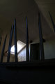
With this scene as is, and using it for this Challenge, I wonder whether a variation in your technicals would have allowed more mood and drama to come into play and light up the scene differently. I like the light coming through the window, but the lack of discernible detail in the foreground, which takes up quite a bit of the frame, is detracting from the interest on the landing/up the stairs. The details discernible in the ceiling dominate too much, and again, draw the attention away from the most interesting aspects of the image (in my opinion), which are the window and possibly the door/doorway. The doorway being 'chopped' makes it a minor feature however.

The broken railings/'sticks' (which on first view I assumed was ironwork/castings), perhaps are an interesting element, however from this angle/perspective are not showcased well enough to be identifiable enough to add to the image.

Comments, Score & Placement Review
118/126 and a score of 4.57 is pretty low, but this is/was a very difficult Challenge. To try to submit an image without a human in it, made it even more difficult to emulate this lady's distinctive style.

Your one comment in-Challenge eludes to perhaps not a strong contender for this Challenge (or maybe they weren't concerned with that, hard to tell), however liked your originality regardless (and their score reflects that). Your other post Challenge comment seems to be familiar with her work and gives a good indication of why they thought the entry not so strong for this Challenge, which is good feedback to receive.

Summary
A little more context and simplicity, coupled with some 'distinctive processing elumation' would likely have given this a little more strength. However as mentioned above, a very difficult Challenge to shoot for, and almost as difficult to receive votes from others who may not be familiar enough with the work of the artist honored, [user]heida[/i].
Photographer found comment helpful.
I'm still standing
09/16/2009 04:52:59 AM
I'm still standing
by snaffles

Comment by ericwoo:
I definitely do not understand your title. The colors you captured are true and appealing to my eye, but the frame feels very, very jumbled. 3.
Photographer found comment helpful.
He's upstairs
09/16/2009 12:18:12 AM
He's upstairs
by snaffles

Comment by delin:
Beautiful composition, maybe too sharp and defined for Heida?
Photographer found comment helpful.
Playing bridge?
09/15/2009 08:10:32 PM
Playing bridge?
by snaffles

Comment by JulietNN:
Okay seriously, I am getting one of your shots again!!!!! I am sure you are sick of my 'indepth' comments by now LOL

Anywayssssssssssss,,,,, In voting I gave this an 8, here are the reasons why.

I didn't think that this was over exposed, I think this could have been dodged a little more to bring out those tiles. now i know that you horizon is not tilted, but the under neigh of the bridge is and that is more prominent because it is red.

so a little more expose would work with this shot, you are sharp and clean on your lines. saturations are good

I still think this shot is great

Photographer found comment helpful.
Playing bridge?
09/14/2009 08:30:50 PM
Playing bridge?
by snaffles

Comment by vawendy:
Fun shot! And I think they're hidden just fine! I like this level of waldo so much better than the ones that were next to impossible. I wonder if I would have the guts to jump. But then I thought, if everyone else was jumping off a bridge... :D
Photographer found comment helpful.
Pages:   ... [344] [345] [346] [347] [348] [349] [350] ... [579]
Showing 3461 - 3470 of ~5790


Home - Challenges - Community - League - Photos - Cameras - Lenses - Learn - Help - Terms of Use - Privacy - Top ^
DPChallenge, and website content and design, Copyright © 2001-2025 Challenging Technologies, LLC.
All digital photo copyrights belong to the photographers and may not be used without permission.
Current Server Time: 09/16/2025 11:03:08 AM EDT.