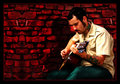
Singin' The Bluesby
Nikonian NinjaComment by LucidLotus: I really like what you've done here. This image has a very.. I don't know.. comic-esque feel to it. Not because of its content but in what choices you've made in processing. That isn't to say it looks juvenile or outlandish either, instead it has a very hip feel that just touches on dramatic without going overboard.
The first thing that grabs my attention and that I want to touch on is the background. I think that brickwall is fantastic. The color is rich and makes an excellent foil for the cooler colors in front of it. The texture of the background is fantastic even if its a digital representation (at least that's what I'm guessing since some of the details repeat themselves), and its almost as if I can see a face starting to form in the negative space portion of it. I don't know if that was intentional or just my mind playing tricks on me but either way it adds to the edgyness.
Next is the border. Many times I look at photos and wonder either why they didn't border it or why they did - at least with the border they chose. Here you've got a strong border but instead of being overpowering or annoying, it is doing its main job and that is framing the image. The thickness is good, it makes it look strong and, to me, feels like its capable of carrying such a visually stimulating image. It stops the eye from wandering and yet relates back to the photo because of the inner red border you added.
Next the shadow. I don't know if that was added in or part of the initial picture but it has a very strong presence and gives dimension to both the guitar player and the image itself. It sort of lends credence to the image - to me its clearly had some digital bits added to it, and the shadow sort of.. I don't know adds a realism that helps counter balance the 'fake' parts. Even if the shadow is fake itself, what it represents is the important part.
I love your subject too. He looks as though he's been glossed over with a bit of gritty pop that makes him really stand out against the background and yet retain some fantastic but subtle textures. His tattoos really jump off his skin and that gives the eye some other areas to explore and wonder about too - there is a red line on the neck that seems overly saturated though. The clarity is good, though it does seem a bit soft on his face and upper body... that said the eye is generally caught by the gleaming pegs on the guitar and so the man's face is almost rendered blurred because my eye isn't paying attention to it anyway. I like what you've done with the guitar, the bright metal and the sparkle really create a sub-main subject within the bigger main subject, which is a nice layering effect compositionally.
The man's pants look a bit odd, kind of like they were spray painted on or something. I anticipate they were actually already there and you did some sort of processing to them to give them this comic/spraypaint-styled appearance. I think it works for this image but of anything presented here, I think they are the one item I find distracting.. weird as it may seem!
Many folks would dismiss this image as not being worthwhile since it isn't pure photography but I really like how you've melded traditional photography with some digital art elements. I think the subject lends itself very well to that practice and what you've done here is take the best of both worlds and merge them. This could have come across as overdone or sloppy but you've done an excellent job. My few nitpicks - the pants striking me as looking a bit odd, the repeating detail in the wall (where the two lines are much lighter than the rest of the wall), and the man's upper body being softer than I'd like - are definitely overshadowed by the areas I think have been very well done.
I could be wrong in the amount of digital art that has been added to this image or vice versa, but whatever went into its creation I think the end result is something to be proud of.
Edited to add: Further viewing makes me think maybe there is more a case of digital manipulation than actual digital art addition where the wall is concerned.. maybe you just copied a portion of it and added it, which would explain the repetition, not that it is a big deal either way, were it a complete fabrication or simply a very striking enhancement of something already there, what's there now is excellent.
Editing again!: Having seen the original, the final product is even more impressive. The bones were there but it was seriously lacking in some oomph, you certainly provided that in spades. Very well envisioned and accomplished.
Message edited by author 2006-09-14 17:31:19.