| Image |
Comment |
| 10/13/2006 07:09:05 AM |
|
 Photographer found comment helpful. Photographer found comment helpful. |
| 10/13/2006 02:46:49 AM |
|
| Photographer found comment helpful. |
| 10/12/2006 10:43:46 PM |
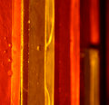
Day-2by magenmarieComment by skewsme: Nice abstract. Part of me really loves the gold and part of me wants to know what it looks like with the yellow saturation taken down a peg. I'm a big fan of earth tones though, and the rusts here are lovely. |
| Photographer found comment helpful. |
| 10/12/2006 09:24:31 PM |
Day-2by magenmarieComment by Elvis_L: interesting abstract. the colors play nice off each other. I think I would have liked a deeper dof but i'm funny that way:) great job. |
| Photographer found comment helpful. |
| 10/12/2006 07:51:55 PM |
|
| Photographer found comment helpful. |
| 10/12/2006 07:46:11 PM |
|
| Photographer found comment helpful. |
| 10/12/2006 03:51:23 PM |
|
| Photographer found comment helpful. |
| 10/12/2006 02:48:09 PM |
Day 1 LEAFby magenmarieComment by silverscreen: Maybe it's not real macro, but it's still nice.
I think I would have prefered another background though. It crashes a little with the leaf's... |
| Photographer found comment helpful. |
| 10/12/2006 01:49:55 PM |
Posing Prettyby magenmarieComment by Balko: Meets Challenge = 2
Technical Stuff = 2
Creativity = 2
Overall Impression = 1
Biased Wow Factor = 0
Super comp, but I'd prefer a different bg color. |
| Photographer found comment helpful. |
| 10/12/2006 12:20:25 PM |
|
| Photographer found comment helpful. |
Home -
Challenges -
Community -
League -
Photos -
Cameras -
Lenses -
Learn -
Help -
Terms of Use -
Privacy -
Top ^
DPChallenge, and website content and design, Copyright © 2001-2026 Challenging Technologies, LLC.
All digital photo copyrights belong to the photographers and may not be used without permission.
Current Server Time: 06/26/2026 10:33:36 PM EDT.