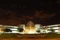
Fountains at my workby
HedsIcComment by ursula: Hello from the Critique Club.
I am having a difficult time writing a critique for this image, because I know that you will be upset if I also say that it looks like multiple light sources, not just one. But here it goes.
Focus is OK, the building, trees and fountain are clear and sharp, the grass, sidewalk and flowers less so but within acceptable clarity.
Exposure: It is difficult to get a good exposure when you have such a contrast between the very light building and the dark surroundings, especially the very dark sky. IMO the lights look blown out, whereas the sky could be lighter. I am not sure how you could achieve this in this situation, except for making a couple identical exposures (one for the sky/other dark portions, the other for the building and other light portions) and merging them in post-processing. Using more than one image would not be legal for the challenges though. Sometimes you can get the two layers (two exposures) from one RAW image.
Composition: Essentially OK. The centred building makes for a rather static image. The colours look rather brown on my screen, and I don't know if this was intentional or not.
Overall: This image was probably not the best choice for this challenge - it really does look like multiple lights (the V shaped shadows would seem to indicate that there is more than one light source). Outside of that, the image is not really captivating enough to sway voters to give you a high score in spite of the perception of DNMC.
Hope this helps.
~Ursula