Seeking Lightby
bgslawComment by macrothing: Originally posted by bgslaw:
I understand several comments state "flat lighting" and lighting could be better. I would like to know how I could improve the lighting.
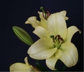
I shot by a window w/ indirect lighting without a flash. |
Repeat my little 'caveat' in my previous comment.
I usually prefer natural light with flowers (just personal preference). You say you've used natural light, indirect, but it is barely discernible in this image. I wonder if it was more prominent before your processing.
Anyway, first thing I notice in this image is that the focus is off (could be blur too). It is a delicate yellow (I'm trying to work out if it is a day lily, amaryllis or other) - nice flower. You mention in your comments two things that intrigued me - you upped the saturation (which I can't 'see') and you applied an unsharp mask. I'm not sure if you were aiming to achieve a certain effect in this image, but it is not 'strong' either way. The background is not enhancing the colors or making the flower 'pop'. A little more distance between the subject and the background, and ensuring there is no 'crease' line visible, would have helped give the image more depth. Lastly, is the 'cut' flower at the bottom. Obviously a difficult crop, so perhaps paying more attention to your composition and 'framing' in camera, would make it easier for you once you get the image to edit.
I didn't vote in this Challenge, but if I did I likely wouldn't have scored this above 3 - because of my reasons stated above, but also because I had/have a different idea of 'flora' - and Challenge themes are important to me when I vote.
Don't pack up the camera if you 'want' to take images - perhaps see how the camera can help you 'create' an image. If these are your favorite subjects, experiment. Experiment with composition, lighting, etc. Get one of your images printed ('largeish') and put it somewhere and study it. See what could be improved. Imagine and then try. Practice makes perfect ... or so they say. Feel free to rip apart/comment on any of mine if you wish to train your eye. Commenting is educational in itself, in a variety of ways.