| Image |
Comment |
| 06/06/2009 10:13:36 AM |
|
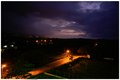
| 06/04/2009 04:44:25 PM |
Night Lightsby IznastYComment by Ja-9: to bad you couldn't get "past" the street lights in the foreground...then the lights in the background would look better |
| 04/07/2008 10:41:22 PM |
Tiltedby IznastYComment by The_Dentist: The pose and toning are very good, but I feel the door is distracting and doesn't add anything to the image. |
| 04/06/2008 04:01:56 PM |
Tiltedby IznastYComment by Alicia: I'm not too fond of it. The tilt has no function really. The image quality is poor in terms of focus and lighting.
This photo could tell a story if upright and with a different title. |
| 04/01/2008 12:17:40 AM |
Tiltedby IznastYComment by geoffb: It's a bit of a portrait faux pas to cut off part of the foot, but I love the angle and muted colours. Nice job. |
 Photographer found comment helpful. Photographer found comment helpful. |
| 03/31/2008 09:39:11 AM |
|
| 03/31/2008 08:17:09 AM |
|
| 03/31/2008 04:42:57 AM |
|
| Photographer found comment helpful. |
| 03/31/2008 12:06:07 AM |
Smoothby IznastYComment by Dirt_Diver: Why did you add text???
Sorry about the DQ man. You can't add text to anything unless they say too. |
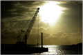
| 03/08/2008 04:33:07 AM |
A Burst Of Sunshineby IznastYComment by h2: well composed shot, except for the tilted horizon. greenish/brownish tone gives an industrial look. contrast is too high, though |
Home -
Challenges -
Community -
League -
Photos -
Cameras -
Lenses -
Learn -
Help -
Terms of Use -
Privacy -
Top ^
DPChallenge, and website content and design, Copyright © 2001-2026 Challenging Technologies, LLC.
All digital photo copyrights belong to the photographers and may not be used without permission.
Current Server Time: 07/16/2026 03:21:30 PM EDT.