| Image |
Comment |
| 09/13/2006 09:54:36 AM |
Deathby inutzaComment by posthumous: the flies seem like puppets in a kiddie version of Grand Guignol. You make a real background look like an enthusiastic diorama. Well done! I gave this a 7, and probably underscored it. |
 Photographer found comment helpful. Photographer found comment helpful. |
| 09/10/2006 08:20:33 PM |
Deathby inutzaComment by jrtodd: OK fit to the challenge, I think if you would have included all sky, without the trees it may have come off a little better. 6 |
| Photographer found comment helpful. |
| 09/08/2006 04:27:24 PM |
Deathby inutzaComment by bmartuch: The green at the bottom seems a bit distracting. Really neat idea though. |
| Photographer found comment helpful. |
| 09/07/2006 10:10:55 AM |
Deathby inutzaComment by riccardino: Even if I like the idea and the composition, I find the fly too little and the negative space a bit too extended. |
| Photographer found comment helpful. |
| 09/06/2006 05:26:56 PM |
Deathby inutzaComment by aj1621: That is so cool! I don't know how you did it, but I like it. |
| Photographer found comment helpful. |
| 09/06/2006 01:49:22 PM |
Deathby inutzaComment by Zigomar: What a contrast between the background and dead flies. And that peace of green forest gives a little hope. Well done. |
| Photographer found comment helpful. |
| 08/14/2006 08:21:17 AM |
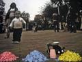
Let's Draw The World!by inutzaComment by atupdate: Hello from the Critique Club:
This was a very interesting concept for the Bits and Pieces challenge; however it was a bit risky, as voters could easily think that it wasn't done with basic editing if they didn't take the time to see that it was validated. In general, there are a couple of technical things that would have made this image stronger. First, the wide-angle perspective of the background image makes it look like the horizon isn't level. This could have been fixed prior to printing the image. Second, you might want to reduce the noise in the background image a bit. The noise doesn't match the sharpness of the chalk, which weakens the effect you were trying to achieve. Lastly, the child's toy directly behind the chalk looks like it should have better focus considering how close to the chalk it is located. I'm not sure how difficult it would have been to clone this out before printing but it would have been worth the effort.
Tim |
| Photographer found comment helpful. |
| 08/08/2006 11:14:15 AM |
|
| Photographer found comment helpful. |
| 08/08/2006 02:12:35 AM |
|
| Photographer found comment helpful. |
| 08/05/2006 06:32:51 PM |
Let's Draw The World!by inutzaComment by Blackbox: I remember the old song...'The primary colors are 1-2-3...red, yellow and blue' . It's a strange edit to me but I guess it works. |
| Photographer found comment helpful. |
Home -
Challenges -
Community -
League -
Photos -
Cameras -
Lenses -
Learn -
Help -
Terms of Use -
Privacy -
Top ^
DPChallenge, and website content and design, Copyright © 2001-2026 Challenging Technologies, LLC.
All digital photo copyrights belong to the photographers and may not be used without permission.
Current Server Time: 07/17/2026 12:39:27 AM EDT.