| Image |
Comment |
| 09/06/2006 09:03:08 AM |
|
 Photographer found comment helpful. Photographer found comment helpful. |
| 09/06/2006 08:55:50 AM |
|
| Photographer found comment helpful. |
| 09/06/2006 01:38:24 AM |
|
| Photographer found comment helpful. |
| 09/06/2006 12:43:19 AM |
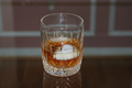
On the Rocksby TomMMDComment by Photologist: Composing the subject (the glass) more off center, and not having those dust specs (bottom left) would have gained an extra couple of points. |
| Photographer found comment helpful. |
| 09/05/2006 03:09:31 PM |
|
| Photographer found comment helpful. |
| 09/05/2006 02:54:43 PM |
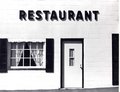
B & W Restaurantby TomMMDComment by TomMMD: Thank you for the comment.
You can seen from the ground line that I was indeed standing off a bit to the left.
The shadows are real and not photoshop.
|
| 09/05/2006 02:40:11 PM |
B & W Restaurantby TomMMDComment by klstover: One thing I notice is that the lines are at an angle, like the perspective is just a bit off. I don't think that detracts too much, because the photo has an old-timey feel, obviously enhanced by the absence of color.
I very very much like how this image has really black blacks and really white whites. It's great how there is so much contrast and yet I don't feel like any of the details are missing.
Also incredible is the shadowing - almost as if the shadows were placed there by someone using Photoshop in order to enhance the letters and other details.
Very good photograph and one I greatly enjoyed looking at! |
| Photographer found comment helpful. |
| 09/04/2006 02:19:20 PM |
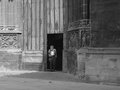
Bordeaux Church Doorby TomMMDComment by TomMMD: Thank you.
I need to do more black and white. I started in photography in black and white and between match-needle exposure, manual focusing, and personal developoing and printing I really had much more control over the picture.
I may have gotten lazy with cheap color. Indeed, my most favorit "color" pictures are really almost monochromatic.
For example.


 |
| 09/04/2006 12:46:36 PM |
Bordeaux Church Doorby TomMMDComment by talj: Hi Tom,
Thanks for the link to this image! My answer to do I like this one better is YES!
Firstly removing the 'posters' has worked well, the focus is now firmly on the gentleman in the doorway. Converting to B&W has taken away so much of the emphasis on the shadow in the foreground and allows the viewer to concentrate on the light shining from the left.
Well done! :o)
- Natalya |
| Photographer found comment helpful. |
| 08/18/2006 03:49:06 AM |
|
| Photographer found comment helpful. |
Home -
Challenges -
Community -
League -
Photos -
Cameras -
Lenses -
Learn -
Help -
Terms of Use -
Privacy -
Top ^
DPChallenge, and website content and design, Copyright © 2001-2026 Challenging Technologies, LLC.
All digital photo copyrights belong to the photographers and may not be used without permission.
Current Server Time: 07/15/2026 03:51:22 PM EDT.