| Image |
Comment |
| 02/02/2003 12:20:09 PM |
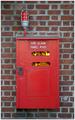
FIRE !!by daysezComment by lisae: Nice, subtle idea. The photo as a whole isn't very interesting though. With plain, centred composition the subject needs to be a bit more appealing... bright colours or interesting textures etc. The "fire alone isn't enough for me to like this photo. |
 Photographer found comment helpful. Photographer found comment helpful. |
| 02/02/2003 08:40:52 AM |
|
| Photographer found comment helpful. |
| 01/31/2003 11:56:11 AM |
Got Cookiesby daysezComment by sylandrix: Greetings from the Critique Club...
FIRST IMPRESSION... when first looking at the challenge entries for milk, this is not one that jumped out at me. I'm not saying its bad, its just missing an element that would make it stand out from others.
COMPOSITION... pretty standard here. I think what hurts the composition is that lack of a simpler background. A solid black or white background would have worked much better. The pattern on the tablecloth distracts my eyes somewhat. Another possibility to improve its "wow" factor would be the lighting. Its very good lighting as it is, very even, not harsh, no distracting shadows, but it would be nice to have catchlights on the glass or something to give the subject "volume". Another possibility might be to get closer in: see if there's an interesting pattern or composition when close: it might make the ordinary subject look extra-ordinary! I'm aslo thinking maybe the framing could be a more vertical one, sort of an anti-landscape crop. This would enforce the vertical lines of the milk glass. Not entirely sure about this. I wanted to try cropping but I'm at a computer with no photo-editing software! If this framing doesn't look better, perhaps it would work on the same subject but shot at a further distance than this one... ? Experimenting with lots of different angles and view points is key :)...
TECHNIQUE... I sorta covered that above when I spoke of the lighting. Everything is is very well done. Very good depth of field, good overall contrast. |
| Photographer found comment helpful. |
| 01/31/2003 11:06:15 AM |
|
| Photographer found comment helpful. |
| 01/30/2003 09:40:34 PM |
Gonsalves and Jerry Placeby daysezComment by jimmsp: Critique Club Critique
(1) COMPOSITION (CONTENT) – I like the composition of this shot. The eye is drawn to the upper right to the sign. Good balance of color between main subject and background.
(2) BACKGROUND – The background you chose works well, an effective use of negative space.
(3) CAMERA WORK ,TECHNICAL – Focus on the sign is very good. I think your choice of aperture gave you too large a DOF. I think the photo is greatly improved with the tree limbs more out of focus. However, I realize the tradeoff you have in time. Using a f/2.8 for instance for good DOF would have only given you a sec or so for the lighting. Probably too short. Was it really dark when you shot this? Any background light hurts you here. The other “distraction” is the lighting of the leaves just beyond the Gonsalves sign. This was probably hard to avoid, but if you did, the photo looks much better.
(4) DIGITAL PROCESSING ,TECHNICAL – Looks good, no suggestions. It would be interesting to see this in b&w.
(5) MY OPINION ON THE PHOTO – A really nice shot, probably deserves a slightly higher score. I would think that more practice with light painting, and a better choice of sign without the close in leaves, will give you a much better shot next time.
Jim msp
|
| Photographer found comment helpful. |
| 01/30/2003 04:49:52 PM |
FIRE !!by daysezComment by karmat: The composition here is static to me, because the shot is straight on, and it is so centered. However, I think it is an awesome idea. I'm not crazy about wild things in post processing, but yours is one that I feel has been done very well. It enhances the photo, without being overbearing. Good work. |
| Photographer found comment helpful. |
| 01/29/2003 11:25:52 AM |
FIRE !!by daysezComment by teachme53: Excellent take on the challenge and very creative. One point off for shooting straight at the object, even a slight angle would be more creative. Good Luck, John Gill |
| Photographer found comment helpful. |
| 01/29/2003 05:15:52 AM |
FIRE !!by daysezComment by LindaLee: Interesting photo, meets the challenge, but not real high impact for me - sorry I can't be more specific, it just doesn't "do" anything for me. |
| Photographer found comment helpful. |
| 01/28/2003 06:19:52 PM |
|
| Photographer found comment helpful. |
| 01/28/2003 12:31:52 PM |
|
| Photographer found comment helpful. |
Home -
Challenges -
Community -
League -
Photos -
Cameras -
Lenses -
Learn -
Help -
Terms of Use -
Privacy -
Top ^
DPChallenge, and website content and design, Copyright © 2001-2026 Challenging Technologies, LLC.
All digital photo copyrights belong to the photographers and may not be used without permission.
Current Server Time: 05/30/2026 06:35:44 PM EDT.