| Image |
Comment |
| 02/15/2006 12:11:38 PM |
|
 Photographer found comment helpful. Photographer found comment helpful. |
| 02/15/2006 11:23:17 AM |
|
| Photographer found comment helpful. |
| 02/15/2006 07:10:43 AM |
|
| Photographer found comment helpful. |
| 02/14/2006 10:26:02 PM |
Flame wave by kiwinessComment by JRalston: I really love this concept. If I had seen it, it would have gotten a 10 from me. Very simple and pleasing to look at. Excellent. |
| Photographer found comment helpful. |
| 02/14/2006 06:32:01 PM |
|
| Photographer found comment helpful. |
| 02/14/2006 03:28:50 PM |
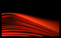
Flame waveby kiwinessComment by kiwiness: Originally posted by loz1:
OK how on earth do you do it? I take a photo of paper, it looks like paper, you do it and it looks far from paper lol |
The final image is not much different to the original, just a few minor adjustments really. Here is the original:

Just a matter of experimenting with lighting and camera settings. Ya kangaroo :) Message edited by author 2006-02-14 15:30:24. |
| 02/14/2006 03:15:38 PM |
Flame waveby kiwinessComment by loz1: Hey sheepy. Nice photo, but it could have been improved if you had used a canon ;)
OK how on earth do you do it? I take a photo of paper, it looks like paper, you do it and it looks far from paper lol |
| Photographer found comment helpful. |
| 02/14/2006 08:58:54 AM |
Amor est vitae essentia by kiwinessComment by kiwiness: Originally posted by hinschn:
it looks like the majority of the highlights in this image are blown out |
Before submitting I check my images using the pipette on the info palette in PS. And I can assure you that even lightest areas on the girl's face all contain color information under 255. Message edited by author 2006-02-14 08:59:15. |
| 02/14/2006 08:20:30 AM |
Amor est vitae essentiaby kiwinessComment by hinschn: Love this shot! Only thing I would have to say is it looks like the majority of the highlights in this image are blown out and the midtones look a bit too flat. I have a sneaking suspician that the overbearing highlights happened in post production. The blue is a nice touch but a bit to overpowering as it looks more like a filter in front of the lens than toning an image. A curves adjustment could take care of all the little things that detract from the image, provided that the original image does not have the blown out highlights as well :) All in all, good job! |
| Photographer found comment helpful. |
| 02/14/2006 07:21:06 AM |
|
| Photographer found comment helpful. |
Home -
Challenges -
Community -
League -
Photos -
Cameras -
Lenses -
Learn -
Help -
Terms of Use -
Privacy -
Top ^
DPChallenge, and website content and design, Copyright © 2001-2026 Challenging Technologies, LLC.
All digital photo copyrights belong to the photographers and may not be used without permission.
Current Server Time: 04/27/2026 10:36:12 AM EDT.