| Image |
Comment |
| 05/24/2006 02:28:07 PM |
|
 Photographer found comment helpful. Photographer found comment helpful. |
| 05/24/2006 11:36:30 AM |
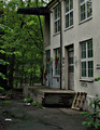
still on recordby raishComment by messerschmitt: i get a very vacuous feeling with this
something like: life is ugly and makes no sense
im sure they have better natural light than this in Norge |
| Photographer found comment helpful. |
| 05/24/2006 01:16:22 AM |
|
| Photographer found comment helpful. |
| 05/22/2006 08:10:20 PM |
still on recordby raishComment by katswig: The more I look at it, the better I like it. I am not quite sure what those objects are doing together like that...and that's one of the things I think I like about it. |
| Photographer found comment helpful. |
| 05/22/2006 10:55:10 AM |
still on recordby raishComment by posthumous: I like the enigmatic grouping of objects, very poetic. The paper reminds me of an EKG, or whatever its called. The rose and the apple also evoke the notion of the "heart." The mechanical object looks like it could be part of some 19th century EKG (as if such a thing existed!), which is carried in a burlap bag (suggesting war to me). The hammer suggests things are unfinished. the EKG needs to be put together, our mind needs to "put together" these items, i.e. to make sense of them. The pencil represents a different kind of creation. Very thought provoking, with figurative and literal representations of the heart. 9. |
| Photographer found comment helpful. |
| 05/21/2006 11:48:45 AM |
|
| Photographer found comment helpful. |
| 05/20/2006 10:13:41 AM |
still on recordby raishComment by fencekicker: I like the choice of objects. I think something needs to be closer to the foreground though. (or maybe crop off the bottom) The composition makes me feel like the objects are shy. |
| Photographer found comment helpful. |
| 05/18/2006 10:59:25 PM |
|
| Photographer found comment helpful. |
| 05/18/2006 04:26:50 PM |
|
| Photographer found comment helpful. |
| 05/17/2006 02:55:22 PM |
still on recordby raishComment by BeeCee: Interesting.... but I just don't like the apple. I like the way the other disparate elements are drawn together by their tones, but the apple doesn't tie in in any way that I see. If it's meant as a contrast, to stand out, it's not vivid/different enough to quite succeed. I really like the lighting and composition, the leading lines, just not that one little thing. |
| Photographer found comment helpful. |
Home -
Challenges -
Community -
League -
Photos -
Cameras -
Lenses -
Learn -
Help -
Terms of Use -
Privacy -
Top ^
DPChallenge, and website content and design, Copyright © 2001-2026 Challenging Technologies, LLC.
All digital photo copyrights belong to the photographers and may not be used without permission.
Current Server Time: 06/11/2026 07:13:44 AM EDT.