| Image |
Comment |
| 06/27/2003 02:25:45 AM |
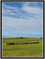
Harvestby manuComment by dsidwell: Everything is so centered; this wonderful shot would be even more wonderful, I feel if you had put things off center to imply a larger world more effectively Super colors, tones and subject. |
| 06/26/2003 05:32:50 AM |
Harvestby manuComment by shadow: the border is not very suitable? photowise, love it. 8 |
| 06/25/2003 11:34:58 PM |
Harvestby manuComment by sagestudio: I really like the composition here. The neat row of bales and the vivid colors. Great job! |
| 06/25/2003 12:44:03 PM |
Harvestby manuComment by pocketed: I like how you got a lot of the sky. It's a great shot. I love the light, the focus, and the color. Very good! |
| 06/25/2003 02:06:24 AM |
|
| 06/25/2003 12:23:12 AM |
Harvestby manuComment by JB707: Beautiful, perfect shot, but the border isn't necessary IMO... |
| 05/13/2003 08:12:18 AM |
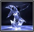
Glass Birdby manuComment by kiwiness: This is just soooo good. The play of light is fantastic and is what really boosts the quality of this image from just another glass statue into a professional image. |
| 05/12/2003 04:11:32 AM |
Glass Birdby manuComment by inspzil: Brilliant lighting effects. Maybe a little too brilliant at the bottom of this piece. Nice effects from the refraction of the light as well. Makes this a real sparkly looking photo. |
| 05/11/2003 08:32:01 PM |
Glass Birdby manuComment by chickadee: perhaps the chage between the floor and wall in the background could have been a bit more subtle
|
| 05/11/2003 03:10:17 PM |
Glass Birdby manuComment by Thomas: I liked this one. Good points are the subject and bacground, includind background reflexes. Bad points are the border (too thick. Without the outer white, I think it would be better), and I think the illumination is a little too strong or direct. Not that the reflexes are bad, but there are too many on the subject itself. |
 Photographer found comment helpful. Photographer found comment helpful. |
Home -
Challenges -
Community -
League -
Photos -
Cameras -
Lenses -
Learn -
Help -
Terms of Use -
Privacy -
Top ^
DPChallenge, and website content and design, Copyright © 2001-2026 Challenging Technologies, LLC.
All digital photo copyrights belong to the photographers and may not be used without permission.
Current Server Time: 04/01/2026 10:06:12 PM EDT.