| Image |
Comment |
| 03/12/2007 02:31:10 PM |
|
| 03/12/2007 11:13:51 AM |
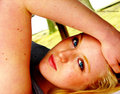
Enduring the Test of timeby albc28Comment by glad2badad: That's a disgrace! Not the image, which is quite nice, but the condition of that flag. I am noticing some concentric rings in the blue sky, polarizer perhaps? Just an observation. Good luck in the challenge. |
 Photographer found comment helpful. Photographer found comment helpful. |
| 03/11/2007 09:51:00 PM |
|
| Photographer found comment helpful. |
| 03/09/2007 07:26:17 AM |
Megan-(IMG-7063)-III-Copyri.jpgby albc28Comment by dwterry: Too much arm... I like the idea, and you probably don't have to crop very much off the left to fix it. I just think showing this much arm makes her arm look fat and distracts from her beautiful face. I agree with faery, need to clone out the acne and reduce the yellow/orange saturation. |
| Photographer found comment helpful. |
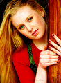
| 03/09/2007 07:24:49 AM |
Megan-(IMG-7241)-Green-III-.jpgby albc28Comment by dwterry: I like this one better than the "arm" picture, but the yellows/reds/oranges are just too strong. The green eyes are intriguing though. As for pose... I like it except her right hand (bottom) feels awkwardly bent at the wrist and it looks a little funny with just 3 of her fingers from the left hand showing.
|
| Photographer found comment helpful. |
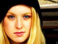
| 03/09/2007 07:23:23 AM |
Megan-(IMG_6955)-IV-Copyrig.jpgby albc28Comment by dwterry: I think this is the best of the bunch. Simple and profound. Probably need to tone down the yellow/orange a bit, but I love her eyes (and by now I'm wondering, what is the true color of her eyes since I have seen 3 different colors each of the three images).
|
| Photographer found comment helpful. |
| 03/09/2007 03:30:58 AM |
Megan-(IMG-7063)-III-Copyri.jpgby albc28Comment by faery: I am not a portrait expert by any means, but I will give you my immediate responses as a lay person.
1.Looking at your shutter speed it may account for a few "things" - she looks very soft focus/ out of focus, but at that speed, the slightest muscles move will be enough to cause the blur. Experienced this recently in the "Alternative Medicine" challenge - no matter how "still" I stayed, microscopic movements caused blur.
The Depth of Field may be too shallow - the focus seems to be on the centre of the arm where I can see clearly defined hairs, but after that the focus weakens.
2. Lack of definition - needing sharpening
3. The colour seems off - very yellow tones - the skin is even yellow in its highlight areas, and the eyebrows are tending towards orange
4. Compositionally: too much skin for a portrait - well anonymous skin: the arm takes up a large area of the image, while I am wishing that the face filled the frame more
5. Ummm tricky to say but just a bit too spotty ... the body freckles/moles are fine (a bit numerous and some could be cloned out however) but the facial red spots definitely need to be cloned out. If an image like this were submitted for a challenge it would fall prey to subjective ideas of loveliness - while natural beauty is to be applauded, in a challenge, it would be penalised, because only truly wrinkly, weathered skin or plastic studio model skin passes....teenage spots are just awkward to look at. Message edited by author 2007-03-09 03:34:34. |
| Photographer found comment helpful. |
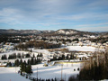
| 03/07/2007 08:09:59 PM |
A view from St Sauveur in Canadaby albc28Comment by PHOTOKID: Hi,
I think you suffered from the crowd that wanted a tree to be the major focal point of the photo, even though the photo is really nice, especially for minimum editing. Thats the feel I get when I look at it though.
Hope it helps,
Rich |
| Photographer found comment helpful. |
| 03/07/2007 06:47:14 PM |
|
| Photographer found comment helpful. |
| 03/07/2007 06:36:35 PM |
A view from St Sauveur in Canadaby albc28Comment by DrAchoo: The technicals: focus is good, sharpness is less than we are used to. exposure is good. Composition is somewhat uninspired (see below).
The feel: a) I don't get a lot of tree feel to this even though there are clearly trees in the picture. More importantly though, the composition doesn't give me a purpose or direction in what I'm looking at. It looks like a snapshot taken of the vista. (that is, little thought was put into where you took the shot from or what happened to be in the picture). Our eye is not given a flow or chief subject to follow or focus on. Instead we just bounce around a bit and then move on.
The game: People were probably looking very much for "tree as subject" in this challenge. |
| Photographer found comment helpful. |
Home -
Challenges -
Community -
League -
Photos -
Cameras -
Lenses -
Learn -
Help -
Terms of Use -
Privacy -
Top ^
DPChallenge, and website content and design, Copyright © 2001-2026 Challenging Technologies, LLC.
All digital photo copyrights belong to the photographers and may not be used without permission.
Current Server Time: 06/25/2026 05:24:40 AM EDT.