| Image |
Comment |
| 03/01/2009 07:36:51 PM |
At the BallGameby albc28Comment by mindbottling: I'm not sure what your subject is. If it's the players, they're a bit too far away. If the whole scene is your subject, there's just not enough detail to hold my interest. |
 Photographer found comment helpful. Photographer found comment helpful. |
| 02/25/2009 08:31:53 PM |
Hello Kitty.....by albc28Comment by samanwar: Yeah okay the shot isn't exactly technically perfect in every aspect, but it doesn't deserve all the ones and 2's and 3's.
I am really getting sick of this culture and mentality, voting should be like judging, people should leave their personal issues they have with nudity, religion, weapons, wars or whatever the subject of the photo may be, and just vote based on the technical quality and the suitability for the challenge subject. |
| Photographer found comment helpful. |
| 02/25/2009 04:15:58 PM |
|
| 02/24/2009 04:11:43 PM |
|
| Photographer found comment helpful. |
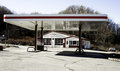
| 02/23/2009 01:43:54 PM |
What used to be....by albc28Comment by Yo_Spiff: Interesting reflections. Seems to be a bit of visible tilt, however. On the other hand, looking at the tree and the top of the awning, this is straight, but on a hill. |
| Photographer found comment helpful. |
| 02/21/2009 10:14:20 AM |
|
| Photographer found comment helpful. |
| 02/20/2009 02:54:49 PM |
What used to be....by albc28Comment by glad2badad: The reflections on the underside of the island roof is quite interesting. Could almost make an abstract out of that by itself. It appears that you were trying to capture the entire scene...sometimes it's better to isolate. Look at this with a crop that removes a good chunk of the bottom, the right (getting rid of car), and some off the left a little.
All JMO of course. :-) Good luck. |
| Photographer found comment helpful. |
| 02/20/2009 12:10:10 PM |
|
| Photographer found comment helpful. |
| 02/02/2009 05:53:31 PM |
Hello Kitty.....by albc28Comment by rlewis: I am not sure the image is complimentary of the young lady, focus seems a little soft and the composition doesn't appeal to me |
| Photographer found comment helpful. |
| 01/26/2009 12:11:26 PM |
Vanityby albc28Comment by MattO: Originally posted by Jdroullard:
Originally posted by picturesbykim:
I like the concept of this photo. The issue I have is where the light falls. The vanity is in her face, and her obsession with her looks while applying makeup. The light falling on her breasts draws the eye away from her eyes. Has the lighting been different I would have scored higher. |
it's the light that draws the eye there? If you say so... But this should have finished much higher. |
ROFL that is exactly what I was thinking. I know why my eyes were drawn there!
|
Home -
Challenges -
Community -
League -
Photos -
Cameras -
Lenses -
Learn -
Help -
Terms of Use -
Privacy -
Top ^
DPChallenge, and website content and design, Copyright © 2001-2026 Challenging Technologies, LLC.
All digital photo copyrights belong to the photographers and may not be used without permission.
Current Server Time: 06/25/2026 08:37:58 PM EDT.