| Image |
Comment |
| 06/10/2006 03:34:31 AM |
Aloneby MrXpressComment by Arti-Elvi: You know, when I saw this challenge this was exactly what came up in my head. I didn't participate by the way. When I think of an empty room I think of solitude. I feel that you succeeded very well in expressing this. Great mood, I really love the emotion you captured here.
Gets a 10 from me. Added to favorites. |
 Photographer found comment helpful. Photographer found comment helpful. |
| 06/10/2006 12:12:57 AM |
|
| Photographer found comment helpful. |
| 06/09/2006 09:11:47 AM |
|
| Photographer found comment helpful. |
| 06/09/2006 07:43:39 AM |
Aloneby MrXpressComment by Judi: Very good use of an empty chamber...I think the person sitting would have more impact....makes it feel like the person has been there longer than if they are just crouching. |
| Photographer found comment helpful. |
| 06/08/2006 07:49:26 PM |
|
| Photographer found comment helpful. |
| 06/08/2006 02:10:40 PM |
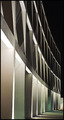
Towering Curves, v2.0 (originally in Night Shot III)by MrXpressComment by yanko: No offense to your retake but I kinda like the original better. I do like how you fixed the tilt in the building but the overall "feel" of the image was better in the original, IMO. For example, the curve in the building was more curvy. The original had the curves converges at the top and swoop down giving it more of a curve. In the retake it's more spread apart from top to bottom and you lose that flowing aspect somewhat. Also, in the original the walls were a lot smoother. In the retake the rough texture is more prominent. I also like how you included the light posts in the orignal. Now maybe that was all done to fix the tilt (by taking a different angle) however, I'd rather see you fix the tilt in post rather than lose extra elements of the scene in this particular case. Now don't get me wrong, the retake is good. I just like the original better. |
| Photographer found comment helpful. |
| 06/08/2006 02:25:49 AM |
|
| Photographer found comment helpful. |
| 06/07/2006 03:58:55 PM |
|
| Photographer found comment helpful. |
| 06/07/2006 08:43:57 AM |
|
| Photographer found comment helpful. |
| 06/06/2006 11:33:45 PM |
|
| Photographer found comment helpful. |
Home -
Challenges -
Community -
League -
Photos -
Cameras -
Lenses -
Learn -
Help -
Terms of Use -
Privacy -
Top ^
DPChallenge, and website content and design, Copyright © 2001-2026 Challenging Technologies, LLC.
All digital photo copyrights belong to the photographers and may not be used without permission.
Current Server Time: 07/16/2026 04:49:27 AM EDT.