Heartacheby
Elvis_LComment by ladyhawk22: Critique Club Critique:
ladyhawk22
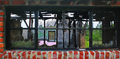
First Impression: An interesting old window with intriguing reflections, but it seems cropped too tight.
Composition: Because the close crop of this shot was something I immediately noticed, I think this is the area of the photo that might be most improved. You have framed the window with a row of bricks on the top, bottom, and left--but not the right. Seems like a strange thing to notice, but it can make a big difference! It looks like we're working with a pretty wide window here, but we want to keep the reflections, cause that's what makes it interesting, right? A tough choice, certainly. At the very least, if you are going to frame the window with brick, I would make sure that frame is on all sides. But I think what I would like to see even more is just more of this building. It's good to fill the camera frame with your subject, but I think we've come a little too close and it's starting to feel cramped. Give those nice reflections a little space to breathe! :-)
Subject: This was a difficult challenge--finding something interesting in a window isn't always as easy as it seems! I think that you chose some reflections which definitely have some interest. There's a variety of colors and shapes, accentuated by the individual window panes. It also appears to be an interesting building, which is likely why I want to see more of it!
Technical (Color, Focus, Light): The colors in this photo came out very well and true to life. The reds of the brick are particularly lovely and offset the colors in the reflections nicely. Focus seems to be pretty good as well. Lighting is good, especially on the lower bricks, but the top bricks are encased in a pretty dark shadow--not a HUGE deal, except that because of the close framing it leaves a large dark area that draws my eye away from your subject.
To Grow It's Vote: I would again suggest a slightly different cropping...I think that would help a lot. Pull back away from the building a bit more and include some more "negative space" to the left or the right. The rule of thirds is almost always a good one to follow. Also, in general, it seems that the photos which scored higher in this challenge were not necessarily based only on reflections...many utilized reflection as well, but generally included part of what was being reflected.
Summary: You have some great colors here which help to capture the eye! Just a couple little things to tweak and we're off and running! The technical aspects of your photography seem to be right on, so just keep up the good work!!