| Image |
Comment |
| 10/18/2006 01:00:15 AM |
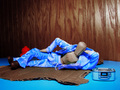
Breakin' 3: woody boogalooby Elvis_LComment by Art Roflmao: Man, I woulda thought this would finish higher. Got a 7 from me. For me, the title kinda hurt because I had no idea it was a breakdancin thing til I read that and then I looked and would have expected to see him in motion or on his head or something. I just liked the setup though. Good job. |
 Photographer found comment helpful. Photographer found comment helpful. |
| 10/17/2006 10:17:16 PM |
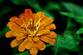
D I R T Yby Elvis_LComment by ursula: Texturized marigold. Hmmmm. The colours are great. I wish the marigold weren't cut off at the bottom. The added texture makes it look almost flat (not flat as in lack of contrast, but flat as in 2-D). I think I like it, but it would take me a bit to get used to it. |
| Photographer found comment helpful. |
| 10/17/2006 09:16:59 PM |
D I R T Yby Elvis_LComment by MattO: Interesting processing. I do like the filter or overlay you put on it, but I wonder about the crop or composition, I would like to see the flower not so cut off near the bottom pedal. |
| Photographer found comment helpful. |
| 10/17/2006 09:16:47 PM |
|
| Photographer found comment helpful. |
| 10/17/2006 07:45:02 PM |
|
| Photographer found comment helpful. |
| 10/17/2006 07:42:05 PM |
D I R T Yby Elvis_LComment by Balko: I like it! Just a nitpik - the bottom petal should have a bit of room around it. |
| Photographer found comment helpful. |
| 10/17/2006 02:47:23 PM |
|
| Photographer found comment helpful. |
| 10/17/2006 12:14:38 PM |
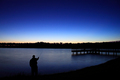
F I S H I N Gby Elvis_LComment by dallasdux: I like this photo a lot and gave it a 9. I cannot think of the term for the darkened corners but I think it is vignetting. The vignetting is actually detracting a bit from the phot and keeping it pretty dark (already adjusted monitor to insure proper brightness). I feel that you were certainly going for the silohuette of the fisher man and there are a lot of dark areas, but I think if the vignetting was reduced by about 50%, this would have been a 10. |
| Photographer found comment helpful. |
| 10/17/2006 06:28:35 AM |
|
| Photographer found comment helpful. |
| 10/17/2006 12:58:45 AM |
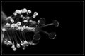
S T I L Lby Elvis_LComment by ursula: The b/w is nice here. I sort of wish the flower weren't sticking out almost straight from the side, in other words, I sort of wish it were angled a bit. But maybe it works better this way, who knows. |
| Photographer found comment helpful. |
Home -
Challenges -
Community -
League -
Photos -
Cameras -
Lenses -
Learn -
Help -
Terms of Use -
Privacy -
Top ^
DPChallenge, and website content and design, Copyright © 2001-2026 Challenging Technologies, LLC.
All digital photo copyrights belong to the photographers and may not be used without permission.
Current Server Time: 07/24/2026 12:48:01 PM EDT.