| Image |
Comment |
| 11/14/2009 05:05:59 PM |
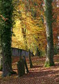
Old Cemeteryby bjoernComment by bobnospum: I like the composition here. Nice use of verticals on the trees and headstones. The focus does not seem to be crisp. The colors are a bit muted and do not provide a "wow" that is useful in these types of scenes. |
 Photographer found comment helpful. Photographer found comment helpful. |
| 11/13/2009 06:29:16 AM |
Old Cemeteryby bjoernComment by Covert_Oddity: Great variety of the colours, nice to see some strong greens in amongst all all the yellows and reds. The shot feels a bit cut off at the near horizon where the wall is, I would have preferred a bit more visible distance there. |
| Photographer found comment helpful. |
| 11/09/2009 10:00:30 PM |
Old Cemeteryby bjoernComment by got2bgutsy: A colour boost and maybe a little more contrast wold have helped here... but great shot anyway... |
| Photographer found comment helpful. |
| 10/03/2009 11:58:55 AM |
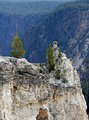
The Lookoutby bjoernComment by Covert_Oddity: Nice area, but the lighting looks a little harsh. Perhaps a different time of day would help this loads! |
| Photographer found comment helpful. |
| 10/03/2009 09:11:16 AM |
|
| Photographer found comment helpful. |
| 08/08/2009 12:53:13 AM |
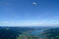
Freeby bjoernComment by macrothing: I gave this a 6 and recall wondering about a closer crop at the bottom to remove the distracting land/lake/city from the 'freedom feel' you get when you view the .. paragliders(?). |
| Photographer found comment helpful. |
| 07/27/2009 04:37:13 PM |
At a lighted tableby bjoernComment by Ecce_Signum: Greetings from Andi via the Critique Club
First Impression: Meets the challenge well, I like the composition and the oof background. Nice sharp focus on the eyes but the rest of his face is a little soft.
Composition: I think you have a strong composition and I quite like the bright light on the bottom left however the yellowish bright spot bottom right is a little offputting for me.
Tecnical: I see you went to a workshop to shoot this and am guessing lighting from below was part of the course? Its not the best angle for lighting a portrait however I think it works quite well here. I think the exposure is a off as (on my monitor) your subject looks a little jaundiced. Some catchlight to bring out his hair detail would help this I think.
Artistic: I think you have approached this portrait shoot well and I like the fact the model is at an angle to the camera yet looking down the lens, it adds interest to the shot.
Overall thoughts: I quite like this shot as a portrait and feel it may be a bit 'run of the mill' for the dpc voters. I think it place about right at just above the challenge average.
|
| Photographer found comment helpful. |
| 07/27/2009 04:18:14 AM |
|
| Photographer found comment helpful. |
| 07/25/2009 10:30:53 PM |
Lookby bjoernComment by macrothing:  Critique Club Critique
First Impressions
Critique Club Critique
First Impressions
Hmm, seems a tourist type shot at a bridge or similar - but even so, could still classify as Street Photography, however there are not enough people in focus, or at least where the eye first rests, to create the interest.
Photograph Information, Technicals & Composition Review
Ok, just read your comments - if your favorite part of the image was the two people at the front, I don't understand why you didn't allow them 'center stage' more. The OOF (out of focus) areas dominate the image too much and cause a distraction from these two. Aside from that, with everyone looking down, and the man pointing down, the mind wants to either 'see down' or at least have some space leading down within the frame.
A more refined crop would also have helped. Perhaps even a very bold one, bringing the girl's distant look into play.
Comments, Score & Placement Review
98/135 seems a little harsh, perhaps - but your last commenter provides some very good insight into your image.
Summary
Possibly good potential with the image as is, but would likely take a bold crop and some tweaking in pp to enhance & portray the 'moment'. |
| Photographer found comment helpful. |
| 07/23/2009 01:03:16 PM |
At a lighted tableby bjoernComment by MonsterPhotography: really nice shot. Nice and sharpe and the eyes stand out. Try recropping it to loose some of that space to the left to loose that light in the and to concentrate your eyes on the subject. A third should do it. |
| Photographer found comment helpful. |
Home -
Challenges -
Community -
League -
Photos -
Cameras -
Lenses -
Learn -
Help -
Terms of Use -
Privacy -
Top ^
DPChallenge, and website content and design, Copyright © 2001-2026 Challenging Technologies, LLC.
All digital photo copyrights belong to the photographers and may not be used without permission.
Current Server Time: 07/19/2026 04:45:59 AM EDT.