| Image |
Comment |
| 12/31/2008 07:38:09 AM |
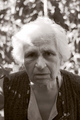
buniby taseComment by choltmeier: Interesting expresion. I like the close crop, although I would get rid of the dead space above her head. That would get her face off center and bring us closer in to focus on the expression. It would also give you fewer bright spots in the top of the image, which would give more detail in teh shadows of her eyes. I like the B&W/sepia treatment. It keeps us focused on her expression. Nicely done. |
| 11/24/2008 09:56:03 PM |
|
| 11/22/2008 01:26:56 PM |
|
| 11/22/2008 01:14:23 AM |
|
| 11/21/2008 10:24:23 PM |
|
| 11/20/2008 10:08:35 PM |
|
| 11/20/2008 09:44:34 PM |
|
| 11/20/2008 04:11:34 PM |
|
| 11/20/2008 11:10:29 AM |
|
| 11/20/2008 10:29:20 AM |
|
Home -
Challenges -
Community -
League -
Photos -
Cameras -
Lenses -
Learn -
Help -
Terms of Use -
Privacy -
Top ^
DPChallenge, and website content and design, Copyright © 2001-2026 Challenging Technologies, LLC.
All digital photo copyrights belong to the photographers and may not be used without permission.
Current Server Time: 05/06/2026 04:56:20 PM EDT.