| Image |
Comment |
| 05/23/2006 10:05:07 AM |
|
 Photographer found comment helpful. Photographer found comment helpful. |
| 05/23/2006 02:05:18 AM |
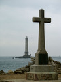
Cap de la Hagueby littlebigmanComment by DefyTime: :: Critique Club ::
I like the shot…or what you were going for. A few things that jump out at me are that if you might have made more space in between the cross and the lighthouse it might be a stronger image. I don’t know if you could or not due to something on the edge of the photo might show up that you didn’t want in it. In a perfect world I would like to see the lighthouse closer to the left side and the cross to the right. This would allow the viewer to see that the lighthouse is an island and add more to your photo. If you just moved a bit to your left you might have seen that….but again I don’t know what is just outside of this frame. Another thing is I wish it had a bit more contrast. I think you have gone as far as you can with the darks but you could have maybe made the whites brighter…make it pop a bit more. The image fits the challenge and I like the DoF…but I could go either way on this making both tack sharp, or making the cross sharp and lighthouse more fuzzy…I can see both working. Nice job and good score.
|
| Photographer found comment helpful. |
| 05/20/2006 01:47:10 PM |
Pleasureby littlebigmanComment by raish: This does not meet the challenge - inanimate but not an arranged composition of objects. |
| 05/19/2006 07:46:32 PM |
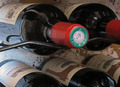
Pleasureby littlebigmanComment by IJacoBean: Nice idea and composition, but it feels like the green label should be in focus. It is closest to the viewer and stands out with its color. |
| Photographer found comment helpful. |
| 05/18/2006 02:08:41 PM |
Pleasureby littlebigmanComment by imagemakersphoto: I would have liked to see the tip in focus. Right now my eyes want to read something, but can not find anything to fully read. I do like the reflections on the botles. |
| Photographer found comment helpful. |
| 05/18/2006 12:07:02 AM |
|
| Photographer found comment helpful. |
| 05/17/2006 04:08:37 AM |
Pleasureby littlebigmanComment by hotpasta: I like this, but I am a little uncomfortable about the awkward feeling composition...I would have liked the front in focus as well, so a longer exposure on the tripod would be good...lighting and feel is fantastic though |
| Photographer found comment helpful. |
| 05/16/2006 02:31:06 PM |
|
| 05/16/2006 11:07:11 AM |
|
| Photographer found comment helpful. |
| 05/14/2006 10:20:54 PM |
|
| Photographer found comment helpful. |
Home -
Challenges -
Community -
League -
Photos -
Cameras -
Lenses -
Learn -
Help -
Terms of Use -
Privacy -
Top ^
DPChallenge, and website content and design, Copyright © 2001-2026 Challenging Technologies, LLC.
All digital photo copyrights belong to the photographers and may not be used without permission.
Current Server Time: 07/16/2026 06:17:37 AM EDT.