| Image |
Comment |
| 01/09/2007 11:48:25 PM |
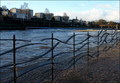
"Metal Waves"by ThaiComment by EducatedSavage: This is such a sharp photo - the contast makes the detail really stand out. This is a beautiful fence/sculpture - the sunlight at the end of it really makes it stand out more more than at the front of the picture. |
| 01/06/2007 03:51:06 PM |
|
 Photographer found comment helpful. Photographer found comment helpful. |
| 01/05/2007 09:30:22 PM |
"Metal Waves"by ThaiComment by threekiddad: Probably one of the most interesting fences in the challenge; nice setting and framing. Great cobblestones too. |
| Photographer found comment helpful. |
| 01/04/2007 09:23:27 PM |
"Metal Waves"by ThaiComment by Tammer: Cool fence. I wonder if lookiing at if from below, or closer or above - a different angle would make it even more interesting. |
| Photographer found comment helpful. |
| 01/04/2007 07:51:02 AM |
|
| Photographer found comment helpful. |
| 01/03/2007 12:13:46 PM |
|
| Photographer found comment helpful. |
| 01/02/2007 12:32:45 PM |
|
| Photographer found comment helpful. |
| 01/02/2007 10:54:18 AM |
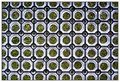
"Granite Circles"by ThaiComment by Bruce_the_Robert: Interesting pattern, well photographed, but I would have liked to have seen either an intentional "skewing" of the lines toward a diagonal, or a more precise shot that aligned the pattern in a perfectly straight way. The slight leftward shift as you move down the image is perceptable here, and doesn't look to me to have been intended. |
| Photographer found comment helpful. |
| 12/31/2006 10:11:45 PM |
|
| Photographer found comment helpful. |
| 12/29/2006 07:17:17 PM |
"I'm stuck on You"by ThaiComment by ericwoo: Hey there from the Critique Club
Camera Work/Technical: Nice, crisp focus and a very nice white balance that yielded terrific color. The blue provides a very nice background that really makes your subject stand out.
Lighting: I think that your lighting is what pulled this image down as far as your score goes. There are several hot spots from the harsh flash that are fairly distracting. Your straight-on lighting also caused some harsh shadows that also pulled from the end score.
Composition/Content: I like the content, but the composition needed better execution. The tilt of the top candlestick gives a crowded feeling to the overall image.
My Opinion: Great subject and a fine job meeting the challenge. With a little better composition and lighting, this score would have been a good deal better.
Eric
|
Home -
Challenges -
Community -
League -
Photos -
Cameras -
Lenses -
Learn -
Help -
Terms of Use -
Privacy -
Top ^
DPChallenge, and website content and design, Copyright © 2001-2026 Challenging Technologies, LLC.
All digital photo copyrights belong to the photographers and may not be used without permission.
Current Server Time: 07/16/2026 09:47:47 PM EDT.