| Image |
Comment |
| 06/24/2006 01:51:09 PM |
|
| 06/24/2006 10:47:01 AM |
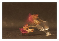
The last breathby Rino63Comment by dahkota: I love this image - with more editing. I took the image into photoshop and adjusted the curves after picking a black point. How amazing! The title is perfect - it all makes so much sense! If you ever do a re-edit of this, please let me know. |
 Photographer found comment helpful. Photographer found comment helpful. |
| 06/23/2006 10:59:11 PM |
The last breathby Rino63Comment by posthumous: picture as poem... the falling of a breath... the fall of man... the fall of innocence. one even imagines that the blurred rose toward the top is still alive. of course we're only fooling ourselves, as we so often do in the face of death. 9. |
| Photographer found comment helpful. |
| 06/23/2006 10:24:44 PM |
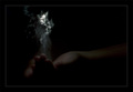
Life sourceby Rino63Comment by mssnare: I have no idea what that is but this photo is amazing! The first one in this challenge to make me say wow outloud. I wish I could give more of a comment then wow but....wow. |
| Photographer found comment helpful. |
| 06/23/2006 08:55:44 PM |
Life sourceby Rino63Comment by MayaM: I keep looking at this and it is just going over my head. I cannot make it out. |
| Photographer found comment helpful. |
| 06/23/2006 06:51:21 PM |
|
| Photographer found comment helpful. |
| 06/23/2006 04:59:38 PM |
Life sourceby Rino63Comment by EarlBaker: I have the feeling that this is a really cool picture that I am rating too low - but I just can't quite figure out what I'm seeing! |
| Photographer found comment helpful. |
| 06/23/2006 01:34:34 PM |
The last breathby Rino63Comment by Jaded_Housewife: I think a white background would have made this look more elegant and tragic. it looks like its on and in front of foam right now. it just deosnt do the concept justice. 5 |
| Photographer found comment helpful. |
| 06/23/2006 01:33:01 PM |
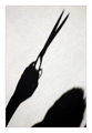
Dedicated to Edward Scissorhandsby Rino63Comment by scarbrd: ---Greetings from the Critique Club!---
The photo meets the challenge, no doubt. But it doesn't really go much beyond that. The photos that scored high in this challenge had more than just the shadow. This picture needs something to give a context. The "Hitchcock" comment is true. I'd like to see some other element of the situation, the potential victim, more of the surrounding room, etc.
The choice for black and white is a good one. Of course there's not much color to a shadow on a white wall anyway.
The frame is a little too thick for my liking, but that's just my opinion. Others may like it. I've found that less is more with framing on DPC challenges.
The best trait of this photo is the composition. You fill the frame well guiding the eye up from left to tight then down to the bottom right.
I hope you find this helpful. Good luck!
Feel free to contact me if you have any questions.
David
|
| Photographer found comment helpful. |
| 06/23/2006 01:18:57 PM |
|
| Photographer found comment helpful. |
Home -
Challenges -
Community -
League -
Photos -
Cameras -
Lenses -
Learn -
Help -
Terms of Use -
Privacy -
Top ^
DPChallenge, and website content and design, Copyright © 2001-2026 Challenging Technologies, LLC.
All digital photo copyrights belong to the photographers and may not be used without permission.
Current Server Time: 06/20/2026 11:06:27 PM EDT.