| Image |
Comment |
| 09/20/2006 12:27:46 AM |
Old memoriesby Rino63Comment by ambaker: Critique Club Review:
Very Nice Photo.
Focus and depth of field are excellent. Color is done well.
I think you've already heard the major complaint over, and over.
I like the tones of of the lamp, book and pencil. But the rest is just too dark. The rest is so dark that the book and pencil become almost disconnected from the lamp. Together they almost seem to float in space. As a mood or dream piece, this could work. But then I would expect to see a softer focus or warmer background.
For some reason, this almost seems to be a piece about death. Perhaps because of the darkness, or maybe it is just me.
Either way, this is still a very good photo and congratulations on finishing in the top 30. |
 Photographer found comment helpful. Photographer found comment helpful. |
| 09/19/2006 10:04:02 PM |
From the earthby Rino63Comment by pineapple: Nice to see some good honest dirt. So many of these hand photos have a light dusting of pretend dirt.. ;-) |
| Photographer found comment helpful. |
| 09/19/2006 07:31:14 PM |
|
| Photographer found comment helpful. |
| 09/19/2006 06:30:03 PM |
|
| Photographer found comment helpful. |
| 09/19/2006 03:12:01 PM |
A simple tree...too much soonby Rino63Comment by ambaker: Critique Club Review:
Focus is good.
Color, saturation and hue are good as well.
The positon and angle of the tree leads the eye out and off the top left of the frame. The overly large ornament competes for attention. If the story being told is that the ornament caused the crash, then the debris around the tree is OK. I assume the tree is not being discarded, at the title tallks about being too soon.
The red backdrop postioned where it is, leaves exposed white wall that also is distracting. There isn't enough there in this view to really tell us that the tree caused the wall to be exposed.
The picture is nice and sharp, and you did a good job with the depth of field. |
| Photographer found comment helpful. |
| 09/19/2006 03:00:29 PM |
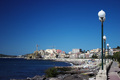
My summer holidays in Italyby Rino63Comment by ambaker: Critique Club Review:
Pretty picture...
I like the sky. For a featureless sky you did well, adding a little interst to it with the polarizer. I'd also vote to eliminate the white spot in the water. It's too small to see what it is, and winds up being distracting.
What I see here, is two sets of leading lines. The lamp posts take us in one direction, to the right. The shoreline tries to guide us to the left, and a tug of war results. As the viewer, I wind up trying to decide what the real subject is. The buildings are a little soft. A smaller f-stop would help here. The lamps are sharp but lead us almost off teh edge of teh frame, and then we have to cross over them to follow the shoreline and road.
My focus keeps winding up at the construction site near the white and red buildings, which is close to center of the picture.
If you could have gotten a bit to the left of this vantage point, the lamps would have lead the viewer in concert with the shore line and that might help.
Overall this is a pretty picture that I enjoyed looking at. Wish I had one like this in my summer vacation book this year. |
| Photographer found comment helpful. |
| 09/19/2006 09:33:24 AM |
|
| Photographer found comment helpful. |
| 09/18/2006 10:07:03 PM |
Freedomby Rino63Comment by BHuseman: I am sorry but I am just not seeing the theme in this one. It doesn't jump out at me like the others do. |
| Photographer found comment helpful. |
| 09/18/2006 03:20:12 PM |
|
| Photographer found comment helpful. |
| 09/18/2006 01:13:22 PM |
|
| Photographer found comment helpful. |
Home -
Challenges -
Community -
League -
Photos -
Cameras -
Lenses -
Learn -
Help -
Terms of Use -
Privacy -
Top ^
DPChallenge, and website content and design, Copyright © 2001-2026 Challenging Technologies, LLC.
All digital photo copyrights belong to the photographers and may not be used without permission.
Current Server Time: 06/22/2026 01:34:18 AM EDT.