| Image |
Comment |
| 08/03/2008 09:12:56 AM |
Shapesby Rino63Comment by jjstager2: Nice colors and composition. A good and unique entry in this challenge. |
 Photographer found comment helpful. Photographer found comment helpful. |
| 08/01/2008 09:40:54 PM |
Shapesby Rino63Comment by tate: I like this a bunch. I don't really 'get' the border though -it would work better without. |
| Photographer found comment helpful. |
| 07/31/2008 12:31:51 PM |
Shapesby Rino63Comment by tootsweet: Visually interesting. Good use of color, excellent use of differing objects. Lighting is interesting. Textural differences, nice comp. Technically, this is fabulous. For me, personally, (subjective here) just not what tickles my fancy. Still an 8 for the effort and technique. |
| Photographer found comment helpful. |
| 07/31/2008 12:37:11 AM |
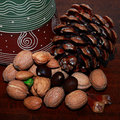
Waiting for the autumnby Rino63Comment by bspurgeon: I like the idea. The lighting is unfortunately poor with very little effective contrast. . There is no depth to the image...needs. I think a few nuts and the cone on a contrasting background would have been sufficient to express your idea and emotion for fall. Good idea. 5 for the effort. |
| Photographer found comment helpful. |
| 07/30/2008 07:45:40 PM |
Waiting for the autumnby Rino63Comment by lemeryj: I like the colours you've chosen. I'm not too sure what the thing in the back is so I find my eyes attracted to it and that makes the focus in the wrong spot. |
| Photographer found comment helpful. |
| 07/30/2008 06:20:53 PM |
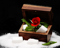
Lo scrigno delle dolcezzeby Rino63Comment by ambaker: Critique Club Review:
Color Saturation and Hue: Colors are vivid, the red is on the edge of over saturation. Hues are natural.
Brightness and Contrast: Contrast may be a little high. The some of the whites in the sugar area have lost detail and are featureless.
Focus and depth of field: Focus is nice and sharp, but maybe a little shallow. Things start to soften by the time you get to the back of the box, and the sugar at the left of the box is very soft.
The compostion here is interesting. I would have liked it a bit better with less saturation, and not so much contrast. A little different lighting angle, not so much top down, may have helped give the sugar some definition also.
|
| Photographer found comment helpful. |
| 07/29/2008 07:41:28 PM |
|
| Photographer found comment helpful. |
| 07/28/2008 11:43:10 PM |
|
| Photographer found comment helpful. |
| 07/28/2008 01:12:18 PM |
|
| Photographer found comment helpful. |
| 07/28/2008 08:04:30 AM |
Shapesby Rino63Comment by kellyo: Love the composition and idea. Very different from the rest. Could be more sharp. |
| Photographer found comment helpful. |
Home -
Challenges -
Community -
League -
Photos -
Cameras -
Lenses -
Learn -
Help -
Terms of Use -
Privacy -
Top ^
DPChallenge, and website content and design, Copyright © 2001-2026 Challenging Technologies, LLC.
All digital photo copyrights belong to the photographers and may not be used without permission.
Current Server Time: 07/17/2026 06:58:40 PM EDT.