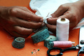
DPChallenge: A Digital Photography Contest You are not logged in. (log in or register
 
Browse Settings
Currently viewing:
Registered UserRino63

Show comments:

Per page:

Order:

Comments:


Comments Received by Rino63
Pages:   ... [174] [175] [176] [177] [178] [179] [180] ... [429]
Showing 1761 - 1770 of ~4285
Image Comment
The traveller
08/26/2008 03:24:22 PM
The traveller
by Rino63

Comment by amathiasphoto:
arrgh, get the person out of there, I think it would be so much better- or make him model somehow. It looks like you got impatient, and just snapped the shot, instead of waiting for him to move. Still great lighting and composition. Beautiful architecture.
Photographer found comment helpful.
Il prigioniero
08/26/2008 01:03:08 PM
Il prigioniero
by Rino63

Comment by LadyK:
wow he looks so unhappy
Photographer found comment helpful.
Il prigioniero
08/26/2008 11:36:32 AM
Il prigioniero
by Rino63

Comment by Donna21:
I really love the colors on this. And I'm giving you extra credit for being so OOB.
Photographer found comment helpful.
Il prigioniero
08/25/2008 08:28:26 PM
Il prigioniero
by Rino63

Comment by DarkRider:
Well for making me Goggle your title you get a comment.Il prigioniero = The Prisoner. Love the idea, don't care for the portrait crop and I find the flowers distracting. I think a step or two closer to the gate would have opened the framing up and helped a bit. You have a little too much color noise going for my liking and not enough for a good effect. IMO
Best of luck. Scott
Photographer found comment helpful.
Il prigioniero
08/25/2008 05:47:45 PM
Il prigioniero
by Rino63

Comment by snaffles:
interesting place to find a horse. 7
Photographer found comment helpful.
Il prigioniero
08/25/2008 05:45:13 AM
Il prigioniero
by Rino63

Comment by LiamD2005:
I like this. Good concept and well executed.
Photographer found comment helpful.
Il prigioniero
08/25/2008 01:52:46 AM
Il prigioniero
by Rino63

Comment by ti_evom:
Maybe a more tightly cropped frame? He seems very little and very centered.
Photographer found comment helpful.
Dressmaker
08/24/2008 07:12:57 PM
Dressmaker
by Rino63

Comment by ambaker:
Critique Club Review:

Color, Saturation and Hue: Colors are good, saturation is accurate, and skin tones are realistic.

Brightness and contrast: The image is not overly bright. But at the same time, the white material behind the hands is blown out and featureless for the most part.

Focus and depth of field: Focus is very good. I really like the detail found in the hands. Depth of field is a bit shallow, as it is soft near the front of the image. I would have liked the pins sharp, rather than soft.

The scissors are distracting and lead the eye out of the image.

I think you really tried to do too much here. The center piece of this image are the hands. Those are terrific hands, and nothing else should be in the way.

I would love to see this done again, with some cloth that has a little color, and just a needle and thread, and those great hands. You have the bones of a very powerful picture here. Keep at it.

Photographer found comment helpful.
Study of the curves
08/24/2008 03:16:49 AM
Study of the curves
by Rino63

Comment by shalrath:
This is one of those times where we put our lives in the hands of those who understand numbers, good take on the challenge. Perhaps a touch busy for me though.
Photographer found comment helpful.
Study of the curves
08/23/2008 05:24:17 PM
Study of the curves
by Rino63

Comment by K3Master:
wheeeee...

feels like a bit of a shoehorn though.
Photographer found comment helpful.
Pages:   ... [174] [175] [176] [177] [178] [179] [180] ... [429]
Showing 1761 - 1770 of ~4285


Home - Challenges - Community - League - Photos - Cameras - Lenses - Learn - Help - Terms of Use - Privacy - Top ^
DPChallenge, and website content and design, Copyright © 2001-2025 Challenging Technologies, LLC.
All digital photo copyrights belong to the photographers and may not be used without permission.
Current Server Time: 08/24/2025 08:14:23 PM EDT.