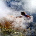
Solfatara-Please don't stolen sulfurby
Rino63Comment by Daybis: Greetings from the Critique Club Gennaro!
First Impression: Cool photo that fits well into the challenge.
Composition: Good composition with great colors. I love the contrast of the yellow sulfur with the green rocks and the purple shirt. The colors work very well together. The vapor seems almost fake and I wish there was slightly less of it around the persons hand, lower portion of the face, and body.
There are a few places in the photo that seem a bit off. A few places the fog feels over exposed. There is also a distracting region on the lower left portion of the photo that seems the contrast was increased in that location, but no where else in the photo. The sulfur in that region almost look like it is glowing red hot. The region is on the basket.
Subject: Great subject. When I look at it, I can feel and smell the sulfur. The bright yellow of the sulfur would make it a fun subject to shoot.
Creativity: You showed a good bit of creativity in this photo. The use of the smoke and colors add atmosphere to the photo.
Improvements: To improve the photo, fix the minor areas that I have mentioned above. This is a really strong photo.
My Thoughts: This is a really neat photo. You really add a lot to your photo through the composition. The photo should have scored a little higher in my opinion.
Overall, great photo. I hope my critique has been help and informativeand If you have any questions please PM me.
Cheers,
Ron