| Image |
Comment |
| 02/07/2006 05:17:59 PM |
|
 Photographer found comment helpful. Photographer found comment helpful. |
| 02/06/2006 09:59:50 PM |
|
| Photographer found comment helpful. |
| 02/05/2006 09:17:58 AM |
4 Years...by tfarrell23Comment by kteach: I like the border you chose here. It keeps with the color scheme and really pulls things together. A nicely composed shot too. Well done! |
| Photographer found comment helpful. |
| 02/05/2006 04:24:20 AM |
|
| Photographer found comment helpful. |
| 02/04/2006 10:53:51 AM |
|
| Photographer found comment helpful. |
| 02/04/2006 09:41:35 AM |
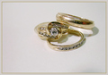
4 Years...by tfarrell23Comment by outland: I like your arrangement of the rings. I might try a more contrasting background, though. Since the metal of the rings reflect what they are laying on, they seem to almost disappear into the white. |
| 02/03/2006 10:26:16 PM |
4 Years...by tfarrell23Comment by AzCKelly: Excellent focus. Looks like a magazine ad. Wonderful lighting. The shadows actually add to the power of this, not usually the case but I like them here. Nicely done. |
| Photographer found comment helpful. |
| 02/03/2006 11:09:21 AM |
|
| Photographer found comment helpful. |
| 02/03/2006 08:24:56 AM |
Ain't She Sweetby tfarrell23Comment by Nelzie: Great idea, the only issue is the lighting. The shadow from the plate distracts from the image. The best ways to over come this is to either bounce the light with a white surface or an additional light off to the right to diffuse the shadow more. |
| Photographer found comment helpful. |
| 02/01/2006 11:14:35 PM |
|
| Photographer found comment helpful. |
Home -
Challenges -
Community -
League -
Photos -
Cameras -
Lenses -
Learn -
Help -
Terms of Use -
Privacy -
Top ^
DPChallenge, and website content and design, Copyright © 2001-2026 Challenging Technologies, LLC.
All digital photo copyrights belong to the photographers and may not be used without permission.
Current Server Time: 05/20/2026 10:45:37 AM EDT.