| Image |
Comment |
| 09/11/2007 06:17:12 PM |
|
 Photographer found comment helpful. Photographer found comment helpful. |
| 09/11/2007 06:27:54 AM |
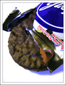
Gimme a York...by tfarrell23Comment by bassbone: set up like a advert is a good idea but the oversaturated blues really take away from that feel. in addition, the choice of rectangular cropping doesn't seem to work here - a square crop or wider crop to include the corner of the wrapper on the left may have helped |
| Photographer found comment helpful. |
| 09/10/2007 09:38:23 PM |
Gimme a York...by tfarrell23Comment by PhotoDave: IMO showing a bit more of the wrapper mite have done a bit better if the viewer didn't know what it was called... nice closeup, descent lighting, blue seems a bit over saturated though, great product shot though :)
-dave |
| Photographer found comment helpful. |
| 09/10/2007 03:30:36 PM |
Gimme a York...by tfarrell23Comment by glad2badad: Yum! :) Nice idea. The blue/purple shadow & tints (color balance adjustment needed) is drawing attention away from the primary subject. JMO of course. Good luck. |
| Photographer found comment helpful. |
| 09/10/2007 02:53:38 PM |
|
| Photographer found comment helpful. |
| 09/10/2007 10:16:46 AM |
|
| Photographer found comment helpful. |
| 09/10/2007 05:17:04 AM |
|
| Photographer found comment helpful. |
| 09/10/2007 02:27:46 AM |
|
| Photographer found comment helpful. |
| 09/09/2007 08:57:19 PM |
|
| Photographer found comment helpful. |
| 09/09/2007 09:25:33 AM |
|
| Photographer found comment helpful. |
Home -
Challenges -
Community -
League -
Photos -
Cameras -
Lenses -
Learn -
Help -
Terms of Use -
Privacy -
Top ^
DPChallenge, and website content and design, Copyright © 2001-2026 Challenging Technologies, LLC.
All digital photo copyrights belong to the photographers and may not be used without permission.
Current Server Time: 05/20/2026 08:35:06 AM EDT.