| Image |
Comment |
| 05/17/2006 11:17:41 PM |
|
| 05/17/2006 06:40:19 AM |
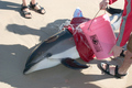
Not Meant to Walk on Landby ewillisonComment by phinbob: I see no link to this challenge. It's a nice shot though.
Photograph a portrait that says something about the subject within the framework of their own environment. |
| 05/16/2006 07:14:12 PM |
|
| 05/15/2006 08:31:26 AM |
|
| 05/15/2006 06:28:47 AM |
|
| 05/15/2006 05:56:21 AM |
|
| 05/15/2006 05:43:24 AM |
|
| 04/20/2006 12:50:08 AM |
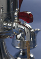
Ummm.... Coffee!by ewillisonComment by ewillison: My photo had several issues to contend with. First, I didn't brew enough coffee to get the pour to flow properly through the nozzle. So I added water... Bad choice, I should have brewed more coffee, instead the coffee looked more like tea. Secondly, my six foot wide white paper blind looks like a postage stamp on the nozzle. Oh if I could have used "advanced" photoshop technics to blend it away. I went with a blue background because my original thought was to make a black and white image. However, the coffee wasn't dark enough to stand out in B&W. So. in the end, I rather liked the red handle, so I went with color. Yes, its slightly over sharpened... I like that effect on metal. However, notice that it doesn't effect the color channels only the luminance. Can you guess how I did that? Oh well, I'm happy with my placing. TTFN |
| 04/18/2006 09:03:14 AM |
Ummm.... Coffee!by ewillisonComment by BeeCee: I like the background colour choice, the picture overall. My only nitpick would be to make the colour of the coffee darker, more appealing. |
| 04/17/2006 02:39:32 PM |
|
 Photographer found comment helpful. Photographer found comment helpful. |
Home -
Challenges -
Community -
League -
Photos -
Cameras -
Lenses -
Learn -
Help -
Terms of Use -
Privacy -
Top ^
DPChallenge, and website content and design, Copyright © 2001-2026 Challenging Technologies, LLC.
All digital photo copyrights belong to the photographers and may not be used without permission.
Current Server Time: 07/15/2026 11:25:23 PM EDT.