| Image |
Comment |
| 05/30/2006 12:39:30 PM |
|
 Photographer found comment helpful. Photographer found comment helpful. |
| 05/30/2006 11:21:03 AM |
|
| Photographer found comment helpful. |
| 05/30/2006 09:15:54 AM |
|
| Photographer found comment helpful. |
| 05/29/2006 12:48:46 PM |
|
| Photographer found comment helpful. |
| 05/29/2006 05:59:04 AM |
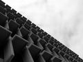
_ _ _ _ _ _by electinaComment by Morry32: interesting, i had to pause and still can't figure out whats going on here, i am not even sure its architecture but i will take your word for it. Looks like cold cubicals. |
| Photographer found comment helpful. |
| 05/25/2006 12:42:30 AM |
Grad Studentby electinaComment by ericwoo: Hey there from the Critique Club
Camera Work/Technical: A bit off focus, but the exposure is dead on. Nice WB to create a nicely tined image.
Lighting: The lighting looks good. No overbearing hues or weird tones anywhere in the photo.
Composition/Content: You captured a very interesting expression from an obviously interesting character, but there was really nothing outside the title to link him to his environment. Keep in mind that many voters overlook the title initially to determine if the shot meets the challenge.
My Opinion: With a little more focus and something in the frame to link him to his environment, this would have drawn a much higher score. Your post-precessing worked very well in this one, too. Looking at your profile, I appreciate the fact that you enter a lot of challenges. It took me 10 months to enter my first 9 challenges. You've done it in under two. Great dedication to learning how to make images that are more appealing to others. Keep shooting and keep entering. I look forward to critiquing more of them. |
| 05/21/2006 01:28:25 PM |
Grad Studentby electinaComment by hideout: The disheveled look represents an exhausted student well, but unfortunately it doesn't look like you put much thought into the backdrop, there is not much to suggest school or student. |
| Photographer found comment helpful. |
| 05/21/2006 10:34:20 AM |
Grad Studentby electinaComment by birgir: Don't see anything in the portrait that connects him to study... envirnmental failure! 1 point from me. |
| Photographer found comment helpful. |
| 05/19/2006 04:14:49 PM |
Dangerous Paths: Cyclingby electinaComment by karmat: CRITIQUE CLUB CRITIQUE
by karmat
My first impression upon seeing this was, "OUCH!"
Compositionally, you have done well by having the tree in the left side of the frame with the bike "hanging" out into the right. Still, though, because the bike is the primary focus, it still feels centered in the frame. This could be making the shot a bit less dramatic than intended. Maybe if there was an angle that wasn't quite so "straight" on it would have had a bit more interest.
Technically, the focus is okay but the exposure leaves a bit to be desired, I think. The details in the black parts of the bike are obscured, and the sky is completely blown out. It could be that the contrast was upped a bit too much. Perhaps, instead of adjusting contrast, you played with levels or curves (or your software's equivalent, if existing) and lightened the darks while not blowing out the sky. Also, desaturating the greens would help that not to "compete" so with the bike. Not knowing what is on the other side of the tree, and assuming it is something like a crocodile infested pond, I won't suggest that you should have moved to the other side to avoid the blown-out sky. :)
It is a truly neat idea.
Best to you in future challenges.
karmat |
| Photographer found comment helpful. |
| 05/18/2006 11:26:16 PM |
Grad Studentby electinaComment by vikas: IMO including a tons of books or computers would have made it a really nice environmental portrait! |
| Photographer found comment helpful. |
Home -
Challenges -
Community -
League -
Photos -
Cameras -
Lenses -
Learn -
Help -
Terms of Use -
Privacy -
Top ^
DPChallenge, and website content and design, Copyright © 2001-2026 Challenging Technologies, LLC.
All digital photo copyrights belong to the photographers and may not be used without permission.
Current Server Time: 07/15/2026 11:02:28 PM EDT.