DPChallenge: A Digital Photography Contest You are not logged in. (log in or register
 
Browse Settings
Currently viewing:
Registered Userelectina

Show comments:

Per page:

Order:

Comments:


Comments Received by electina
Pages:   ... ...
Showing 201 - 210 of ~279
Image Comment
Baby Hummer's feeding time
06/07/2006 08:53:53 PM
Baby Hummer's feeding time
by electina

Comment by hideout:
Precious. A bit soft in focus, though it's amazing you captured a moment when the hummingbird isn't fluttering a million miles an hour.
Photographer found comment helpful.
Baby Hummer's feeding time
06/07/2006 02:15:05 PM
Baby Hummer's feeding time
by electina

Comment by scotthadl:
If this were only sharper this would be a great shot.
Photographer found comment helpful.
Baby Hummer's feeding time
06/07/2006 12:43:48 PM
Baby Hummer's feeding time
by electina

Comment by mamba:
the purple halo is something that could b taken out if it were advanced editing. thats the main problem i can pick out in this one.
Photographer found comment helpful.
Baby Hummer's feeding time
06/07/2006 10:42:47 AM
Baby Hummer's feeding time
by electina

Comment by tjbel05:
How sweet, great clarity.
Photographer found comment helpful.
Baby Hummer's feeding time
06/07/2006 02:14:02 AM
Baby Hummer's feeding time
by electina

Comment by sherpet:
I like this one.....
Photographer found comment helpful.
Baby Hummer's feeding time
06/07/2006 01:31:32 AM
Baby Hummer's feeding time
by electina

Comment by Balko:
1-2 Meets Challenge - 2
1-3 Technical Merit - 2
1-3 Creativity - 2
1-2 Extra Credit - 1
Final Score - 7
Photographer found comment helpful.
_ _ _ _ _ _
06/06/2006 02:29:27 PM
_ _ _ _ _ _
by electina

Comment by HBunch:
*Critique Club*

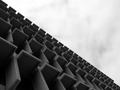
This is definately different. I'm not sure it appeals to me on a personal level. Just not my thing.
The first thing I notice is the horizontal divide of the photo. I'm thinking that in my opinion it might be just slightly TOO perfectly divided. It's got a good balance of light and dark, but the part that really draws the most attention from me, is the horizontal meeting line between light and dark, and that is not really where I'd think the main focal point would be.
I think the angle is good. I like that it's kind of got a mysterious feel to it, like we are really unsure of exactly what we're looking at.
Focus seems soft overall. I think this might be better with a crisp focus and sharp lines.
Not sure WHY you chose black and white since you didn't state your intentions for the photo in your details. But I think this could benefit from some color. Was the sky blown out or bland? Maybe shooting at a different time of the day might help?
Again, I'm only going on personal opinion and assumptions since you have not left me anything more in the comments.
Overall interesting shapes, but I'm just not feeling it.
~Heather~
Photographer found comment helpful.
_ _ _ _ _ _
06/04/2006 02:26:25 PM
_ _ _ _ _ _
by electina

Comment by littlegett:
Depth of field for this is icky, could use more contrast, and doesn't really show architecture. to me it looks like a bunch of empty chairs.
Photographer found comment helpful.
_ _ _ _ _ _
06/03/2006 11:32:57 AM
_ _ _ _ _ _
by electina

Comment by catholicskin:
This better not get underrated! 9.
Photographer found comment helpful.
_ _ _ _ _ _
05/31/2006 09:48:47 AM
_ _ _ _ _ _
by electina

Comment by neophyte:
A sharper image of this capture and perspective would be a ribbon contender. nice comp amd shadows.
Photographer found comment helpful.
Pages:   ... ...
Showing 201 - 210 of ~279


Home - Challenges - Community - League - Photos - Cameras - Lenses - Learn - Help - Terms of Use - Privacy - Top ^
DPChallenge, and website content and design, Copyright © 2001-2025 Challenging Technologies, LLC.
All digital photo copyrights belong to the photographers and may not be used without permission.
Current Server Time: 07/31/2025 08:30:02 PM EDT.