| Image |
Comment |
| 03/30/2003 11:59:05 PM |
|
 Photographer found comment helpful. Photographer found comment helpful. |
| 03/30/2003 11:03:40 PM |
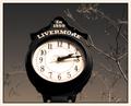
Time Keeperby TarbiniComment by dsidwell: Simply wonderful tones here. The sky is fabulous, but what really makes this image effective to me (the frosting on the cake) is the way the lacy branches echo the lettering of the clock. Delightful to look at. High marks from me. |
| Photographer found comment helpful. |
| 03/30/2003 08:51:48 PM |
Time Keeperby TarbiniComment by KarenB: I really like the tones in this shot.. is it a cross between sepia and b&w? I'd like to learn how to do this. |
| Photographer found comment helpful. |
| 03/30/2003 05:22:46 PM |
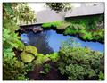
Tranquillityby TarbiniComment by karmat: CRITIQUE CLUB CRITIQUE
by karmat
COMPOSITION
Your composition is really effective the way the walk (?) draws the eyes from the upper right to the left, then the water takes them back to the right. Also, the three "bands" of color really break the photo up and add interest to the shot.
TECHNIQUE
The focus and lighting is really good in this. For my personal taste, the greens may be a touch over saturated, but with 9 inches of unexpected snow on the ground outside, I think I like it anyway! :-)
OVERALL EFFECT
This shot has some really neat elements in it. The longer I look at it the better I like it. Very peaceful, and pleasant. Nice work.
karmat |
| Photographer found comment helpful. |
| 03/30/2003 01:36:10 PM |
|
| Photographer found comment helpful. |
| 03/29/2003 11:56:18 PM |
|
| Photographer found comment helpful. |
| 03/28/2003 07:48:25 PM |
|
| Photographer found comment helpful. |
| 03/28/2003 09:20:13 AM |
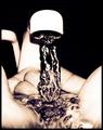
Liquid Lifeby TarbiniComment by sylandrix: Greetings from the Critique Club!...
COMPOSITION...I found that this image particularly stood out among the competition in kitchen art. The high contrast and monotone colors are what give the image its appeal I find, and having an undistracting background and purely frozen motion helps a lot :) I think also the angle and closeness the hands were shot at also suggest an intimacy with the subject - it really feels like the photographer and their camera is not present, and we're viewing the scene from the owner of the hands (though not really, the angle's a bit too low, but still, that's what it feels like). Perhaps the only advice I would impart here, is that the way the hands are positioned, with the faucet almost centered, suggests a symmetrical composition, and yet that symmetry is broken because of the angle the picture was shot at... Shooting the faucet straight on may have enforced the symmetry better and added some more strength to the composition.
TECHNIQUE... You lose some focus towards the back and front of the hands, but not enough to hurt the photo. Highlights are blown but it creates a surreal, high-contrast image that is still appealing.
OVERALL... A highly effective image. Would have just tried enforcing the symmetry that is already present. Kudos! |
| Photographer found comment helpful. |
| 03/28/2003 09:03:12 AM |
|
| Photographer found comment helpful. |
| 03/28/2003 12:46:28 AM |
|
Home -
Challenges -
Community -
League -
Photos -
Cameras -
Lenses -
Learn -
Help -
Terms of Use -
Privacy -
Top ^
DPChallenge, and website content and design, Copyright © 2001-2026 Challenging Technologies, LLC.
All digital photo copyrights belong to the photographers and may not be used without permission.
Current Server Time: 07/17/2026 12:25:22 PM EDT.