| Image |
Comment |
| 05/01/2003 12:14:12 PM |
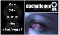
Can you see the challenge? by TarbiniComment by Kavey: Nice treatment of image.
Not keen on overall composition - the divisions just don't seem to be the right size to balance each other - especially when two are black and one so light.
The website name is hard to read.
Not keen on faded logo beneath left panel or the blurred "see" text.
Best imrovement to me would be to completely lose the left panel - I like the resulting square sticker rather a lot.
5, Kavey |
| 05/01/2003 11:59:54 AM |
|
 Photographer found comment helpful. Photographer found comment helpful. |
| 05/01/2003 11:36:55 AM |
|
| 05/01/2003 11:20:21 AM |
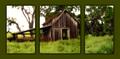
Go ahead, take your best shot ... by TarbiniComment by Konador: Nice choice of colour on the font, which goes well with the sepia photo. That really makes the 'Prints!' stand out nicely. I like the (then print me) but I think that you could do without the word 'at'. I think it kinda spoils the flow of the text. I also think that because you have included a comma in the slogan, you should alsp punctuate it at the end with a ! |
| Photographer found comment helpful. |
| 05/01/2003 11:14:46 AM |
|
| Photographer found comment helpful. |
| 05/01/2003 08:56:28 AM |
|
| Photographer found comment helpful. |
| 05/01/2003 01:35:54 AM |
|
| Photographer found comment helpful. |
| 05/01/2003 01:15:30 AM |
|
| Photographer found comment helpful. |
| 05/01/2003 12:41:24 AM |
|
| Photographer found comment helpful. |
| 05/01/2003 12:22:24 AM |
|
| Photographer found comment helpful. |
Home -
Challenges -
Community -
League -
Photos -
Cameras -
Lenses -
Learn -
Help -
Terms of Use -
Privacy -
Top ^
DPChallenge, and website content and design, Copyright © 2001-2026 Challenging Technologies, LLC.
All digital photo copyrights belong to the photographers and may not be used without permission.
Current Server Time: 07/17/2026 06:41:48 PM EDT.