| Image |
Comment |
| 11/27/2006 12:12:45 AM |
Winter Wheatby aberrationComment by Jutilda: I'm craving a bit more negative space with this one. I do like the tones and the diagonal line of the wheat. |
 Photographer found comment helpful. Photographer found comment helpful. |
| 11/26/2006 04:31:28 PM |
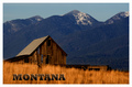
Montanaby aberrationComment by Ivory: Very pretty, love the soft golds in front against the old barn, nice colours! |
| Photographer found comment helpful. |
| 11/26/2006 05:41:55 AM |
Montanaby aberrationComment by rayg544: I told my wife that I'd like us to retire in Montana. Your postcard shows the reason why! Great job!! 10 |
| Photographer found comment helpful. |
| 11/24/2006 03:20:05 PM |
|
| Photographer found comment helpful. |
| 11/23/2006 12:26:03 PM |
|
| Photographer found comment helpful. |
| 11/22/2006 07:49:12 PM |
|
| Photographer found comment helpful. |
| 11/21/2006 08:30:14 PM |
|
| Photographer found comment helpful. |
| 11/21/2006 02:00:16 PM |
Montanaby aberrationComment by UNTITLED: Great composition and very nice warm tones. The subtleness of this postcard works well with this scene. Very nice! |
| Photographer found comment helpful. |
| 11/21/2006 01:54:46 PM |
Montanaby aberrationComment by cogerox: Love the lettering. Makes me feel like building something. Nice tones throughout. Good composition. I'm ready to go. |
| Photographer found comment helpful. |
| 11/21/2006 09:57:26 AM |
Montanaby aberrationComment by digitalknight: see how the M and O look like they are further apart from each other than the rest of the word? in a real post card that would be kerned in so the "optical illusion" of kerning would be fixed.
Photographically there seems to be too much black - the dark sections feel muddy to me. A light touch of levels, curves, or shadow/highlight would really bring this to life. I would also punch the cyans and add 8 to the hue to push them more to blue if this were my photo.
Hope all that helps. :-) I'm envious of the beautiful place you live. |
| Photographer found comment helpful. |
Home -
Challenges -
Community -
League -
Photos -
Cameras -
Lenses -
Learn -
Help -
Terms of Use -
Privacy -
Top ^
DPChallenge, and website content and design, Copyright © 2001-2026 Challenging Technologies, LLC.
All digital photo copyrights belong to the photographers and may not be used without permission.
Current Server Time: 06/21/2026 09:25:40 PM EDT.