| Image |
Comment |
| 08/05/2006 09:27:41 PM |
Sunby KronusComment by SandyP: He's so CUTE!!! I love those freckles. He looks so innocent and "boyish" :) Really nice portrait!!!
|
 Photographer found comment helpful. Photographer found comment helpful. |
| 08/05/2006 08:13:03 PM |
|
| Photographer found comment helpful. |
| 08/05/2006 05:39:59 AM |
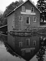
Morningstar Millby KronusComment by Ian-Andrew: I love old buildings like this. You have came across a great location here and the composition looks good, black and white works well but perhaps this image needs some more contrast between the blacks and whites.
Here is a photo of an old building near to where I live that you may be interested in as it is very similar to your image (old building, reflection, white sign on the front, etc)...

|
| Photographer found comment helpful. |
| 08/05/2006 01:39:57 AM |
Morningstar Millby KronusComment by SandyP: Wow! I love that mirror image in the water. It's like double the nostalgia and feel of this photo. Fantastic job. |
| Photographer found comment helpful. |
| 08/04/2006 02:17:10 AM |
|
| Photographer found comment helpful. |
| 08/03/2006 01:26:19 PM |
Calvinby KronusComment by Jutilda: Really great stop action. I love the bright red of their uniforms. Great facial expressions too. |
| Photographer found comment helpful. |
| 08/01/2006 09:37:04 AM |
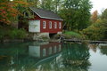
Reflectionsby KronusComment by Ben: I think the composition and time (seasonal) of the capture is great. The still reflection in the water works really well. I do agree with the other guys though, in that it needs a bit of punch. The colours are very samey and thus a little drab. If the saturation and contrast was just nudged up alittle i think it would bring out the colours in the leaves and the red of the house really nicely.
Great shot never the less. |
| Photographer found comment helpful. |
| 07/31/2006 03:01:14 PM |
Reflectionsby KronusComment by elsapo: very beautiful location! Your composition and colors are great ;).. one thing that could make the image stand out more is using the brightness/contrast tool.. reducing brightness and adding contrast (just a little).. then maybe dodging lightly on the red "house" and trees. :) |
| Photographer found comment helpful. |
| 07/31/2006 10:18:28 AM |
Reflectionsby KronusComment by dale99: This is a beautiful shot. I probably would have lightened it a little more and possibly increased contrast slightly to give it a little more pop, but those are just personal choices and you may be going for a more subdued look. |
| Photographer found comment helpful. |
| 07/31/2006 06:29:31 AM |
Youngestby KronusComment by Gunnsi: IMO the tight crop at the bottom is making the picture more like a window. The crop at the top is ok. The light is a bit harsh, making the shadows dark on the neck. The focus is good and the subject is a beautiful child. Love the light in the hair and also how crisp the focus is on it. |
| Photographer found comment helpful. |
Home -
Challenges -
Community -
League -
Photos -
Cameras -
Lenses -
Learn -
Help -
Terms of Use -
Privacy -
Top ^
DPChallenge, and website content and design, Copyright © 2001-2026 Challenging Technologies, LLC.
All digital photo copyrights belong to the photographers and may not be used without permission.
Current Server Time: 07/18/2026 03:18:35 PM EDT.