| Image |
Comment |
| 02/16/2003 05:43:34 AM |
|
| 02/15/2003 11:13:26 PM |
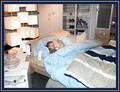
Shop Til You Drop (at IKEA)by smellyfish1002Comment by PTLParsons: Beautiful photo of a cute little boy, but not for this challenge. I don't even understand your title. This is beautiful, and probably and 8 or 10 for a "cliche" challenge. For this challenge it is nothing. And that's a shame. |
| 02/14/2003 05:44:32 PM |
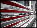
The Silver Dinerby smellyfish1002Comment by Swashbuckler: Good perspective shot. All the chrome with the red is very pretty/striking. Framing - looks good to me! Color - I don't see anything wrong/bad there either. Focus - seems perfect to me. The sun flares in the chrome aren't really bad, but I've never met a flare that I truly liked. Interest - moderate to high, mostly due to the chrome and red. 8 Swash |
| 02/14/2003 03:41:21 PM |
The Silver Dinerby smellyfish1002Comment by MajorChaos: Nice shot. to bad its not spring or summer or fall, anything but winter would have made this a much more intresting shot! not that its a bad shot... |
| 02/14/2003 03:00:54 PM |
I've Bean Latte'd!!by smellyfish1002Comment by jmsetzler: Greetings from the Critique Club :)
I think this is an excellent before and after shot... I particularly like the composition of the glass on the right side of the frame. The 'path' of the glass creates a nice leading line as well. The contrast of the glass against the bean background also adds a nice element to this photo.
The only area I can see for some possible improvement is the lighting... there is a strange gradient in the 'path' in the beans that looks slightly strange... I don't know if any additional depth of field would help that or not...
Keep up the great work :)
John Setzler
|
 Photographer found comment helpful. Photographer found comment helpful. |
| 02/14/2003 04:16:04 AM |
The Silver Dinerby smellyfish1002Comment by lisae: This is neat. It's a busy photo, but those red lines really tie it all together and give your eyes something to focus on. Interesting and different and creative. |
| 02/13/2003 09:14:17 AM |
The Silver Dinerby smellyfish1002Comment by jmsetzler: very interesting idea on the perapective challenge... the red stands out nicely here and the reflections give it a nice abstract feel.. nice work :) - setzler |
| 02/12/2003 11:52:50 PM |
Open Wide!!by smellyfish1002Comment by DougPaz: Greetings from the Critique Club };-)
Initial thoughts
Beautiful composition, meets the challenge, colors are stunning
Composition/ Content
I feel like I can almost smell it we are so close. Focus, lighting and exposure are all super.
Background
The shallow DOF works well here and the light green color works well as a background.
Camera Work - Technical
Focus seems good and contrast is excellent. You've really got a killer shot. Some folks may want to see the entire flower but I think this is right on.
Digital Processing - Technical
I'm trying to come up with something helpful here but basically you have an almost perfect technical shot IMHO.
Fits The Challenge
Definitely fits the challenge well.
My Opinion On The Photo
Super shot that probably deserves a ribbon. The quality of shots this week were incredible though. Great job, and keep up the good work.
I would be happy to talk further about this shot if you would like to contact me.
DougPaz
|
| 02/12/2003 08:05:57 PM |
|
| 02/12/2003 12:21:44 PM |
|
Home -
Challenges -
Community -
League -
Photos -
Cameras -
Lenses -
Learn -
Help -
Terms of Use -
Privacy -
Top ^
DPChallenge, and website content and design, Copyright © 2001-2026 Challenging Technologies, LLC.
All digital photo copyrights belong to the photographers and may not be used without permission.
Current Server Time: 07/18/2026 01:25:35 AM EDT.