| Image |
Comment |
| 07/03/2006 12:43:38 AM |
|
 Photographer found comment helpful. Photographer found comment helpful. |
| 07/02/2006 09:57:40 PM |
|
| Photographer found comment helpful. |
| 07/02/2006 09:32:10 PM |
|
| Photographer found comment helpful. |
| 07/02/2006 07:44:27 PM |
|
| Photographer found comment helpful. |
| 07/01/2006 10:09:43 PM |
Please tell me I don't have to read all this!!!by talikfComment by locutus: I think this is a great idea for a "blur" composition. With a little bit of work, the "great idea" could become a great photo. A few things I'd look to improve:
1. Framing: the 2 main elements of the photo - the book and the face - are both a little out of frame. I would have made sure that all of the book, at least, was in-frame.
2. Lighting: the lighting on the face is a little flat. I'd have tried to get a little more contrast happening on the face.
3. Focus: the crispest, best lit part of the composition is the shoulder; well away from what are (I assume) supposed to be the main elements - the face and the book. This draws my eye away from the main elements.
Don't get me wrong, it's a gresat idea, and there are some very good elements in the execution. The blur of the pages and the lighting on the book is well executed, and the expression on the face is just right. If you'd got a better result in the other areas that I mentioned, it would have been great. |
| Photographer found comment helpful. |
| 07/01/2006 08:03:21 PM |
|
| Photographer found comment helpful. |
| 07/01/2006 06:31:46 PM |
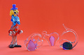
The Glass Circusby talikfComment by Melethia: Good studio type shot of glass objects. Colors are nice, you kept detail in the clear edges, nothing seems blown. |
| Photographer found comment helpful. |
| 07/01/2006 04:54:32 PM |
|
| Photographer found comment helpful. |
| 06/30/2006 07:36:41 AM |
The Glass Circusby talikfComment by SergeP: simple and great colours and light. I would have been happy with the clown and one other animal... |
| Photographer found comment helpful. |
| 06/30/2006 01:28:20 AM |
|
| Photographer found comment helpful. |
Home -
Challenges -
Community -
League -
Photos -
Cameras -
Lenses -
Learn -
Help -
Terms of Use -
Privacy -
Top ^
DPChallenge, and website content and design, Copyright © 2001-2026 Challenging Technologies, LLC.
All digital photo copyrights belong to the photographers and may not be used without permission.
Current Server Time: 07/16/2026 10:46:45 PM EDT.